Hi everyone,
I’m new to the design forum thing but I have been told it’s a great way to get feedback on my work so here it goes.
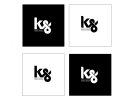
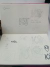
I have been working on rebranding my online/printed portfolio and attached is my personal logo I have been working on. The idea was to make a font out of my “KS” quick hand signature based on my favourite type Akzidenz-Grotesk. It has since developed from there and this is what I have. I did the classic designer thing where I worked on it until I was happy, then went away, came back to it and hated it, so I’m not sure if I’m just being overly critical of myself or if there is something wrong with it.
Please can anyone offer feedback or suggestions on how to improve or make changes to it if any are needed?
(I’m not really that sensitive but I have been known to burst into tears when anyone says anything bad about my work, only joking please be honest :icon_smile

