Personal Logo

lintu22

New Member
Hello all,

I'm new to this forum, and wanted to join so I could talk to similar people and find some critique on my own work.

Anyway, I have been trying to make a logo for myself for a few weeks but I am extremely harsh on myself, and those who's opinions I do ask of tell me to change my work into ways I feel is not good enough.

Anyway, I will show you something I have been working on today. I need some things to put into a portfolio whilst I job hunt aswell so knowing which is best would be helpful (I am a recent graduate).
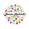
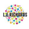
laurenrichardscouk.jpglaurenrichardscouk2.jpg

The one on the left I came up with first, then my friends opinion was to change it so it looked like the one on the right. To me I feel it loses its character and becomes more difficult to read. (I went with the circles and colours as I want to come accross as creative, but playful). He said the banner is tacky and the font is too (on the first one). I don't really agree, but I want to know what other people think too.

Thanks in advance :icon_smile:
 
I do not like being a harsh critic but your friends opinion is right on the money. The first is tacky, the second is far more refined. The text looks a little grey, maybe try a deeper black, other then that it is a good logo.
 
I actually think the second one is quite hard to read, and will be even more so when it's scaled down (and again when it's reproduced in greyscale). I think you need to simplify the whole thing for it to work as an identity.
 
I think you're right! There's something been bugging me about the whole thing, and I think it is actually the fact it is too much. I need something more simple and meaningful.

Thank you for the comments, the identity thing just clicked in my head though haha.
 
I agree the second one is very hard to read and would also be a nightmare for anyone with vision problems. All that aside...how come the full stops between your name are 100% black but the actual name is about 80%? OK it may be intentional to show separation but it actually looks like a mistake at first glance.
 
Someone else said that. :icon_blushing:
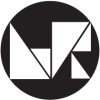
Anyway, I have scrapped that design and I've gone with this.
lr.jpg
What do you think of this one?
 
Hi Lintu22,

My advice to you would be to really dumb it down. Simplicity is key when it comes to logos. It's much more important to get across who you are and what your product or service is, at an instant, rather than trying to be too creative or clever with your design. Now although what you have posted is fine for design ideas, they're not really suitable for a logo as such. You remind me of how I was when I was a recent graduate. I think your still maybe in that student mindset. You'll soon make that transition from thinking over creatively, to realising that precise, clear, effective and straight to the point designs make a much bigger impact than anything too fancy. You don't want your potential clients to struggle to understand or read your logo.

You should see my logo, it's nothing special, I didn't use any fancy fonts or anything, it is very simply and to the point and lets people know who I am at first sight.
 
I would suggest that if you are going to go down the initials route, is to find one strong concept with the lettering rather than making the letters randomly visually appealing.. i hope that makes sense :)
 
Hey,

First and foremost it needs to reflect your work, the latest logo is quite edgy and modern - is your work like this? It reminds me of some Buro Destrukts or Designers Republic old work. Get back to basics and try not to push it to hard.

Many people go with a logo that is simple and clean... This was you eliminate it dating or categorising yourself to a particular style.

Good luck!
 
Hi Lauren,

Echoing what the others have said, simplicity rules. You know what it says, though your average Joe Bloggs isn't going to have the patience to break it down and perceive what those shapes are supposed to be. Your goal shouldn't be to make your logo look "cool" or "edgey", it should represent you. If by chance it has those characteristics by chance through the process once you've designed it, great! two birds with one stone. To be honest, there's nothing really unique about the design. Both of the logos you've showed remind me of other logos I've seen before.
 
Last edited:
Can I go against the grain here and say that I quite like it (the latest one, that is) and that I disagree that the logo mark itself has to be so clear as to what it is?

Why does it have to immediately scream out the letters L and R to people? I imagine it is likely to be accompanied by the text 'Lauren Richards' in most places that a prospective client would first see it and, beyond that, once the client is a client it isn't so important to reiterate, they'll recognise the mark now.

I think it needs a little refining still... it feels a bit clunky and there's definitely more work to do on it. But I don't think it's as bad as seems to have been implied.

That said, there is such a difference between the first post and the recent one that I agree, they do appear to represent different businesses which may be something to think about.
 
Back
Top