You are using an out of date browser. It may not display this or other websites correctly.
You should upgrade or use an alternative browser.
You should upgrade or use an alternative browser.
Personal logo up for critique
- Thread starter Kev Clarke
- Start date
Fries With That
Member
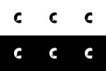
Top or bottom left work best in my opinion
Tony Hardy
Well-Known Member
Love the concept. Like Dave L has said though, I think the thought bubble could do with a little more work? Have you tried drawing up loads of bubbles and then swapping them in and seeing what works and what doesn't?
I'm also not sure on the entire width of the C? I'd maybe extend it out a little?
I'm also not sure on the entire width of the C? I'd maybe extend it out a little?
Kev Clarke
Member
Thanks all for the feedback, as mentioned above it is an initial draft design, don't really know why i posted the 2nd/middle design looks awful.
Both the first designs at this early stage seem to be the front runner where the thought bubble are more easily recognisable.
Tony, i'm on it thats the next stage get drawing thought bubbles like a man possessed!
Both the first designs at this early stage seem to be the front runner where the thought bubble are more easily recognisable.
Tony, i'm on it thats the next stage get drawing thought bubbles like a man possessed!
bluebeaniebelle
New Member
I like the top left 
Kev Clarke
Member
I have made the changes mentioned above to the initial concept, and now all circles in the design are at a ration of 2:1 increasing.
I have also attached a couple of designs where the shape of the c has changed and would appreciate your opinions on what looks right? I am little concerned about the negative/void space that will be created around the design and how text will look next to the mark?
Cheers Guys.
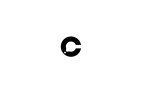

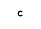
I have also attached a couple of designs where the shape of the c has changed and would appreciate your opinions on what looks right? I am little concerned about the negative/void space that will be created around the design and how text will look next to the mark?
Cheers Guys.


Tony Hardy
Well-Known Member
I'm a fan of the third one.
Also, the edges are really rough? You're not using Photoshop are you? Haha
Also, the edges are really rough? You're not using Photoshop are you? Haha
Kev Clarke
Member
That seems to be a side affect of saving as a jpeg and cranking the image size up.
Amy_Alternate
New Member
Hi - really nice concept, number one works best for me but I also like number 3! :]
