Personal Branding - potential update

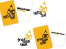
Hi guys, I'm thinking about updating my logo to the new version at the below dribbble link. I've also included the original and an alternative stamp version I did a while back. I'd love to know your thoughts. I want to push onto the next level and could really do with getting this spot on to go along with a new set of marketing material. Let me know your thoughts! Thanks in advance!:icon_smile:

Dribbble - Updated personal branding ideas by Dan Blackman

Dan
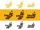
 
Really nice and clean. I like the single colour version better. I think it's a lot more cohesive and stronger.
I get the implication of the name in relation to the pencil icons, but only because the alternate logo is there with the chip cone. The stamp logo isn't as good, but could be used to extend the identity, if the pencils were illustrated in precisely the same way.
The only thing I'd be careful with is the yellow colour. You're going to have to handle it very carefully in it's application to make sure it contrasts enough with background colours.

I don't think an explicit link between the name and chips is needed. I'm guessing you've chosen the name because you are always offing a 'little bit more' (that or you just do work on the side :) bu-dum-tish *sorry*
 
New one is much nicer, clean, tidy and just looks more polished. I don't like the stamp one though. And I'd probably go with the yellow and black version.

Good job.
 
Cheers guys, I've been working on an updated version of the new one with a better font in my opinion. Will post up shortly! Exciting times!
 
I'm with Arrivals, Dan. Think the original update looked much better than this one; I prefer the other font and, as also mentioned, the mark doesn't sit quite as well with the text for me.
 
Thanks for the honesty guys - makes the process much easier, I'm going to propose some alternatives with the previous font to ensure it's spot on but I've already got some nice clean ideas for marketing materials. Will update shortly. :icon_cheers: Thanks
 
Yeah, I prefer the right as well. I don't think the pencils are too large at all and the proportion to the text works nicely :)
 
I do think the second font looks a bit nicer set out like that, but feel I'd still opt for the top one. Looks really smart all set out though, and I would put it down as being fairly memorable too so I wouldn't worry about that, it's a neat job.
 
Thanks all, at the moment pretty split opinions between the two fonts! Will see what everyone else thinks before uploading final logo along with some printed material! Watch this space :)

Really appreciate all the comments. Thanks
 
I'd go with the top set. Though wouldn't necessarily use the same font in your logo, for the text on the back. It looks a bit to big and bulky for that. If it were me, I'd find a nice 'content' font to use along side your logo.
 
Back
Top