You are using an out of date browser. It may not display this or other websites correctly.
You should upgrade or use an alternative browser.
You should upgrade or use an alternative browser.
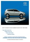
Opinion about this design ad pls?
- Thread starter mimoza_79
- Start date
SparkCreative
Member
You could spell 'Adrenaline' right to begin with.
john watters
Member
Feedback
Hi Mimoza_79,
The basic concept behind an ad is getting across an idea/emotion or to create interest to view and purchase.
Your ad, though technically competent, I personally think misses out on a few points.
1. The emotion you are trying to convey 'increase the Adrenalin'
The font and the position is not conveying the thought 'INCREASE' the font is basic, and can be
effective if simply small and bold, with confidence.
2. The most major omission is the Corporate logo...TOYOTA would insist, and a contact, www or phone.
3. The vehicle is a 'P Registration??' remove the plate altogether.
4. The vehicle is static with muddy tyres think further, tilt??? What will get the adrenalin going in the
mind of the viewer?
A well produced technical piece, but go back to the emotion you wish to convey and consider the image, then
question..is this getting me the message that a Toyota 4x4 get's my heart beating faster and is thrilling?
Interested to hear your thoughts.
Hi John Watters
I think that I understand my mistakes, and I agree with you for everything. I think that I have better design in my new one. I will attach here again. It is hard for me because I am not a graphic designer. Thank you very much for your help.
The new one still need some work, but I think its quite better
Attachments
john watters
Member
Mimosa
Hi Mimosa,
This covers all the rudiments of an ad now.
What and who. As a non Graphic Designer, well done. The next stage is if you wish to make it into a campaign.
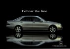
3 ads maybe (go the extra mile, your tutor would appreciate it...grades?) As you are using the 'Line' approach,
maybe take it a little further (if you wish) Think of maybe two more headlines on the same theme including
'the line'.?
Good initial understanding, go for it.
Best
John
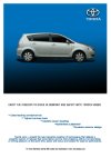
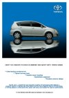
I just start a course for graphic design and I think that the tutors wants to see my ideas  . I have another adverts would you help me again please. I dont know wich one of these is better. I had a look at th magazines but steel I am strugglinng with the typography and the elements of the layout.
Attachments
john watters
Member
Hi Mimoza
I have looked at your ads, and am a little confused.
If you are starting a course, what is the course? You should be starting with colour/design, type and
image layout. If the course is an advertising course, I would suggest you look at a range of ideas before going
into a final finished generated piece of work. Sketch out (scamp) ideas, as many as you can think of
and consider the best, consider why? Get feedback and then work up to a final ad.
Being honest, the ads are competent computer generated pieces, but a great ad has an idea and the photograph or image is used to get across the concept in an interesting way to create interest and reaction.
Take a look on 'Ads of the world.com' but if you are doing a 'Graphic Design' Course you should first investigate and attempt to understand what 'Graphic Design' is as a basic.
Best
John


