Not so much a crit more a cry for help...

bigdave

Well-Known Member
I've picked up a little branding job (woohoo). It's more of an artworking job as the clients have been very specific about colours, content font styles etc.. As it's a fairly low budget job I'm not really inclined to spend too much time an effort dissuading them so have pretty much just gone along with the brief. Usually when the client's been really specific, I can put it together and say it's X Y & Z that are ruining this, but on this occasion, there's something that makes me tilt my head to the side and slightly screw my face up but I cant for the life of me work out what! It's driving me mad!
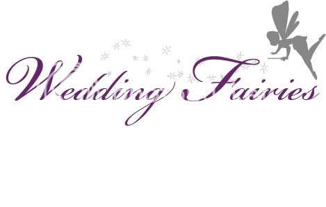
WEDDINGFARIESLOGO.jpg
 
It's based on tinkerbell as those were the instructions from the client but is a completely original vector.

As for taste, You and I both know it looks like a kids party but it's what the client wants so what can I do.
 
If people are looking at the fairy and immediately assume I've just ripped off Disney, then perhaps the fairy needs more work to move her away from that?..
 
If people are looking at the fairy and immediately assume I've just ripped off Disney, then perhaps the fairy needs more work to move her away from that?..

I think you are far enough away from the classic Tinkerbell silhouette to be OK (can't believe I just typed that sentence).
 
I thought Tinkerbell too. I suspect the font is making your eyes go a bit squiffy. Have you tried it with the stars in front of the letters - perhaps with a white fill?
 
You seem to know a lot about it Corrosive!!!

Yeah, fair comment. A friend of ours runs a children's party business and someone else did the logo for her in a very similar way so been round that loop once or twice. And obviously a massive Disney fan :icon_wink:
 
Thanks for the opinions guys. Think some work on the fairy is certainly needed. I hate the font but it seems to be the most legible scripted font in my collection. I might have a rake through some discs this aft and see if I can find any others.
 
I agree she should maybe be a little less Tink'ish. I have this irrational hate of scripted / cursive fonts :icon_biggrin: Maybe go for something slightly less traditional but still cursive, in the style. For wedding stuff I have done I have often used "Little Days" font Little Days font by West Wind Fonts - FontSpace

...sorry I can't be much more help :icon_notworthy:
 
The different weights are making my eyes go funny. I don't know if it's because the uppercase characters are heavier, or if the lowercase are too 'delicate'?
 
I can see what you mean but all the text is the same weight?... Perhaps reducing the font size of the W and F might reign things in a bit.
 
That's what I meant, they're the same weight but because the initials are larger in size they appear to be a heavier weight.
 
The footprint's a bit of an awkward shape with the fairy so high up at the end there... I don't know how much of a free hand you have (or whether it'll look any better) but my first stop would be to try putting 'Fairies' on a new line, indented up to the downstroke on the 'g' of 'Wedding' (i.e. the top of the 'F' sharing horizontal space with the bottom of the 'g') and moving the Fairy device (which is fine) into the space top-right (pretty much as it is currently in relation to 'Fairies') and then losing some of the twinkles.

Clear as mud?
 
The fairy looks to me as though she is about to sumersault... could she be a little more upright...?
Tend to agree with Dave L with putting Fairies on a new line
 
ok my first thought was that the color size of the text was too dark/thick but as i looked at it the sketch appears wrong to me because;

in the foreground - a nice header and in the back ground - theres a fairy making stars - and they dont appear related (unless ones brain fills in the dots of course)

meh :icon_rolleyes:
 
Back
Top