New Website

Status
Not open for further replies.

Tash

Member
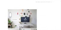
Hi guys - I've had a bit of a rebrand since joining and have also got a new website! i'm very excited about it!
It would be great if you could have a look at it and give me some feedback!

just to point out - i know for the contacts page its not great that i don't have clickable buttons for email/social media etc but i've built this using behance's 'Prosite' and it doesn't seem to support this function... either that or i'm being extremely thick.

Thanks a lot! :)

Tash Page
 
Hi Tash,
It has a nice strong creative impact and lots of really good high quality work on show.

Here's a bit of feedback from my point of view:

- Blog needs work on it: tash.jpg - That's not brilliant use of screen estate.
- Text is too small and pale throughout - it's almost like you're using typography to say 'don't read this!' and my ageing eyes are agreeing.
- You have your portfolio labelled as 'Design' which isn't clear to me at all. I'm a fan of completely unambiguous navigation and the 'Don't make me think' approach.
- Can you reduce some of the white space? I get you want to give space to the work but the excessive vertical scrolling is a pain in the butt.
- Any chance of making the design responsive?
- Do you really like carrot cake?
 
Thanks Edge! :)

I have tried making the font bigger especially for the intro paragraphs and am still working on this - negotiating certain things with that website is a challenge sometimes!

I totally agree with the blog - Last time it just imported the content for my blog and applied its own settings to it that were severely limiting in terms of how it is designed. My actual blog looks so much better - it's kind of like pinterest in terms of layout, I think literally last night they must have made some changes as they now have the option to edit widths (which I've done so it looks a little better i hope - will do something with the font on that later one today) and link pages to external sites - faced with a small dilemma now of whether to keep the intergrated blog or link it to the external one....
pro: external one looks much better
con: doesn't have all the navlinks which make it easier to go back to the main site when done reading - it's a bought template and my coding/tumblr knowledge is not brilliant.
(thoughts?)

Same story with the white space - the way it works is you upload your stuff to a gallery on behance and 'push' it to the site - then the 'design settings' - i.e. the spacing etc are blanketed across the whole site and doesn't let me change this for specific pages (as far as i can tell) - if you look on the photography page for example, there's only (on my screen anyway - please let me know if it's different for yours!) about 1.5cm space between each picture. I can try cropping the white space out of the original images on some of the 'about me' sections and see if that makes a difference though.

I'm with you on the vertical scrolling - I hate it - i'd prefer a gallery which has little prev/next/ arrows..... also if it was up to me i'd just have some clickable icons for the whole social media page and stick it at the bottom somewhere. 99% sure it doesn't support that though.

I'll have a look into the responsive side of things but i'm pretty sure that it's not going to let me if it won't even give me gallery display options.

For anyone thinking about prosite - if you're like me and you're not great with coding it's really easy and relatively fast to make a site and get it looking slick and have it actually work, but there are some features that are seriously limiting like gallery type, no hyperlinks etc.
 
I sense a little project for you - get it set up in Wordpress, buy a theme for about £20 and customise it and then add gallery plugin.
 
I might actually do that next year you know - I'm pretty cash-strapped and jobhunting at the moment and have forked out about £70 for this for a year. Hopefully by next year I'll have enough funds to send myself on a web design course so I can get it exactly the way I want. I'm pretty happy with it at the moment though - just a few little niggles like the gallery view that annoy me :)
 
I think it's great, I like it! A couple minor niggles but I can get over it. Nothing to be over critical about. I remember you posting up that poster you did for Kingston Gym as you had some printing issues. Out of curiosity, how did you get that project to do? Was it paid work? I live near Kingston and I am always interested in new ways to find work.
 
you and me both! (and cool! a neighbour!! :) )
The printing issues seemed to magically resolve themselves when they were printed on someone elses printer! Frustrating, but a bit of a relief that it wasn't really my fault. Really can't wait to get some more paid work so I can get rid of this old printer and buy a decent one. It was sort of paid work - I was doing some other promotional (not design) things for the gym and they threw that project in - so not specifically paid a rate for that poster but they threw a few extra quid in on top of what they were already paying me for the other stuff. Got the job via total nepotism - my boyfriend works for the gym. Really hoping to get some freelance clients in soon though as I'm currently looking for a job!
 
Me too! I have tried so many things, I get lots of positive responses from 'potential clients' and that's about as far as it goes. Lots of empty promises for work but at least I get some form of communication as opposed to when I was looking for full time employment. Feels like i'm taking one step forward and two steps back :(
 
Not a fan to be honest, there is no content for me to read, it's all image based, when I land on a site, I want to be greeted by text which draws me into your site e.g. "We design your dreams".

The CV should be on a page, and have the option to view / download as a PDF

The blog should be on your own site (and not on a blog site such as Tumblr).

Basically your site is all looks and no substance, you need text for the mighty Google to read and index, at the moment your site is just a few images

You need to have something on your site which makes me want to stay on the site and I cannot think of one reason I am afraid.

People buy from people, and you have nothing about you (I am James, I do xx, xx and xx, I love doing xxx and blah blah blah" so why should I hire you to work for me?

There is a line between a beautiful site and useful site, and yours is far towards the beautiful side, as it has no usability

Finally, lets say I wanted to contact you in regards to work, where is your phone number, email address etc? I cannot hire you if you hide your details.
 
Your work's nice and the elements of the site are all fine but I tend to agree with the 'style over substance' concerns (above)... I also felt that I was doing an awful lot of clicking and scrolling and not getting enough in the way of a return for the time spent.

In short: flesh it out and tighten it up.
 
Thanks Dave. I'm stuck with the scrolling for a bit as I've paid for the site for a year and there's not much I can do about it and I can't afford to buy a new one. I'm not a web designer so making my own is not an option, nor is paying a web designer to do so currently. I see what you're saying but when I spoke to other designers when I was setting out on the create-a-portfolio journey they all said the work should speak for itself, and to keep writing to a minimum. I guess it's a balancing act between not enough and speaking for itself.

@ Gareth - In the 'about me' tab there are links to all my social media and contact information in the 'speak to me' section. This website doesn't let me put hyperlinks in, so I've had to design all of that in a kind of infographic way. The same story with the CV - it' is there, under the CV tab which downloads as a PDF. I just don't have the option to view it beforehand :)
And I quite like tumblr. The way the site lays it out is a bit bland, but I don't see much wrong with using a blogging platform providing you keep it relevant - it lets you connect with loads of other people. It's easy to blog on-the-go and share things. I love pinterest but it's not so easy to link things. My form of blogging isn't really essay-based - it's more magpie-sharing.
 
Last edited:
@ Gareth - In the 'about me' tab there are links to all my social media and contact information in the 'speak to me' section. This website doesn't let me put hyperlinks in, so I've had to design all of that in a kind of infographic way. The same story with the CV - it' is there, under the CV tab which downloads as a PDF. I just don't have the option to view it beforehand :)
And I quite like tumblr. The way the site lays it out is a bit bland, but I don't see much wrong with using a blogging platform providing you keep it relevant - it lets you connect with loads of other people. It's easy to blog on-the-go and share things. I love pinterest but it's not so easy to link things. My form of blogging isn't really essay-based - it's more magpie-sharing.

Hi Tash

If you have to explain how to find something, then it's not been done right...

Your contact details need to be on every page, in a prominent position so when a visitor lands, they can find how to contact you

When I started out, I didn't have my number on my site, I then added it 3 months later and I was getting so much more work as people will want to be able to talk to you

Having your cv as a pdf is poor as well as most people either cannot view (browser settings) it or don't want to (I hate viewing pdf's when on a site).

Tumblr is so unprofessional though, the domain is theirs e.g. tashblog.tumblr.com and you have no control over the site if they decide to shut it down (like posterous are doing).

It's also a visitor killer, you're sending your visitors to their site, a really good chance is they won't go back to your site, so sale lost

Tumblr is great for personal blogs, but for business blogs, you need to control it yourself

Hosting your blog on your own site is so much more beneficial (especially for user interaction) and gives you an added boost in regards to seo (google loves regular content).

If you're limited to what you can do on the site, by your website platform then it's time to move the site, as you should never be restricted on your own website, as it causes so many issues.

I am just moving a graphic designer from a crappy site which has no portfolio to a fully functioning site, it will make a huge difference in him recommending the site to the clients but also help with the seo.

In my opinion, graphic designers are the worst for websites, as they only see the aesthetics while there are so many more things needed including usability and actually getting a visitor to buy.

A lot of GD's websites are really poor and let them down.

Being brutally blunt, you need to start again from scratch, but don't think about designing until you have got a list of features you need, and then choose a platform that gives you that functionality.
 
oh god i love the landing page sooo much! Looks awesome. The last vertical on the H doesnt seem to join properly on the E though. All the work I love. Site looks totally brill, little bit of functionality issues and finding things but whatever, it works.

To be honest without starting a war, dont listen to jack the lad above me. Take a look at his site and compare to yours.
 
To be honest without starting a war, dont listen to jack the lad above me. Take a look at his site and compare to yours.

Mine is functional, where the website we are discussing is all substance....

Mine is being redesigned and will ask for your opinion when ready but I gave my opinion and not asked for insults...
 
Not a fan to be honest, there is no content for me to read, it's all image based, when I land on a site, I want to be greeted by text which draws me into your site e.g. "We design your dreams".
I don't think text is a big draw at all - certainly wouldn't draw me in especially on a portfolio site. It's supposed to be image based - what do you expect from a design portfolio for crying out loud?
The CV should be on a page, and have the option to view / download as a PDF
Why - is that really an issue?
Basically your site is all looks and no substance, you need text for the mighty Google to read and index, at the moment your site is just a few images
The looks are the substance as it's a design portfolio. However if there is any desire to get traffic via Google it is horribly optimised
You need to have something on your site which makes me want to stay on the site and I cannot think of one reason I am afraid.
Well, I can - to see the quality of the work she has produced - I'm amazed that reason didn't occur to you.
People buy from people, and you have nothing about you (I am James, I do xx, xx and xx, I love doing xxx and blah blah blah" so why should I hire you to work for me?
Not on the internet they don't. That's a marketing paradigm for the offline world. They look for quality and value. As if I'd choose a graphic designer because she likes gardening...
 
What I was getting at was that the site is visually pleasing. I get what she does, I like what she does. Her work is great. The site showcases this well.

If I were in the market for a designer and was referred to said site I would be impressed. After all she is not marketing herself as a UX designer.
 
Last edited by a moderator:
Status
Not open for further replies.
Back
Top