Hot on the toes of the recent launch of the new Gap logo, MySpace has revealed it's new identity...

Further reading on the new logo:
New MySpace Logo Joins the Pack of Recent Company Re-brandings - Velocity - Remaking Personal Technology - Forbes
MySpace Unveils New, Artsy Logo
Will be interesting to see what feedback this logo gets following on from the major backlash on the Gap logo, I have a feeling it will be more positive as the existing/familiar MySpace logo was never that strong.

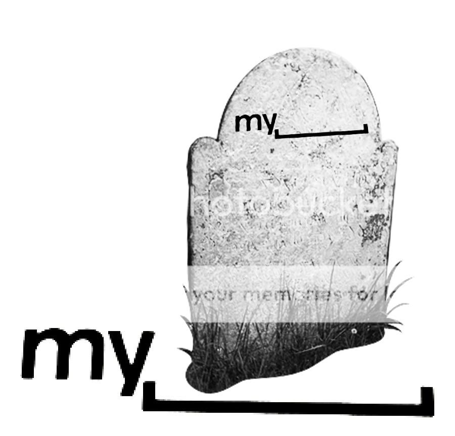
Personally I like the concept, to have the confidence to drop the word altogether from the logo will allow a great deal of freedom with their marketing, but wonder if it might be perceived as a bit pretentious? I'm guessing with Facebook's dominance in all things social networking MySpace is looking to promote the music/bands side, and really connect with peoples interests more directly.MySpace VP of Product Mike Macadaan unveiled the new logo in his presentation, “Designing for Real-Time: The Usability of ‘Right Now.’” Instead of keeping the actual word “space” in the logo, they’ve decided to go with a literal interpretation by replacing the word with, that’s right, absolutely nothing. Macadaan’s reasoning is that because MySpace is a “platform for people to be whatever they want,” the company is giving them “the space to do it.”
Further reading on the new logo:
New MySpace Logo Joins the Pack of Recent Company Re-brandings - Velocity - Remaking Personal Technology - Forbes
MySpace Unveils New, Artsy Logo
Will be interesting to see what feedback this logo gets following on from the major backlash on the Gap logo, I have a feeling it will be more positive as the existing/familiar MySpace logo was never that strong.
")