

yellowdog
Member
First of all, can I just say that I am fully aware of my terrible computer skills when it comes to creating a logo. I am currently working with expensive programs called paint and publisher.
Long story short, I've got a screen print studio and have been printing commercially for about 2 years with my brothers. After our first year we spiced things up and created a brand called yellowdog and after that launched just before xmas we set about separating the two halves of the business to give them each a bit more credibility, with the clothing brand keeping the name yellowdog.
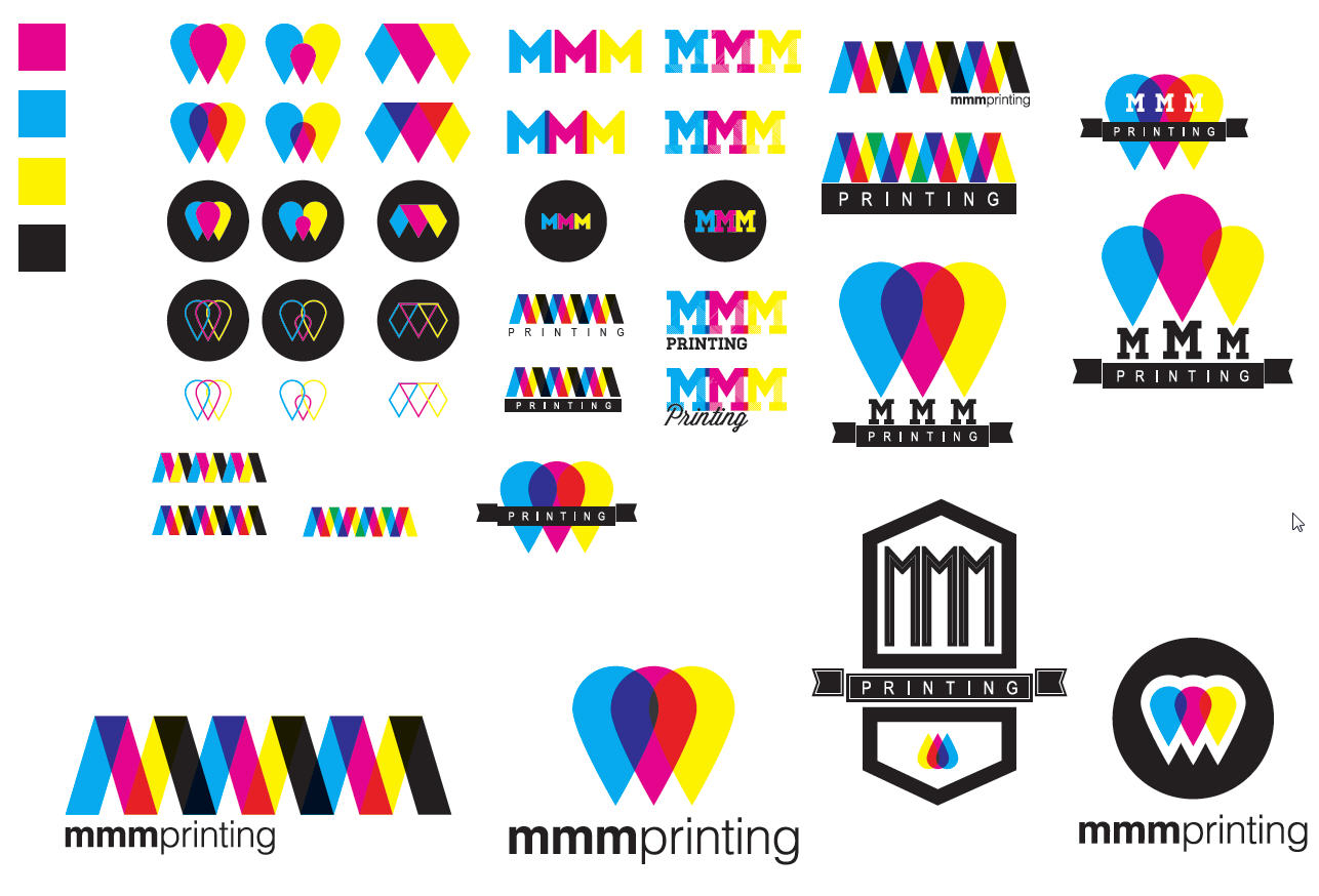
After much deliberation my 2 brothers and I settled with the name mmmprinting (our surname is Mackie, ie mackie, mackie & mackie printing and possibly at a glance....mmm that printing looks/tastes good) for our commercial arm and decided to create a crude logo (image no1) to get things moving. We all agreed it wasn't a very clean attempt so we paid a logo man on the net to clean it up and provide us with extra concepts (image no2) in case we had missed a trick. All 3 of us still prefer our first logo so we declined the logo mans offer of developing any of them further for extra money and ran.
After 1 or 3 beers tonight I've created a logo (image no3) that us 3 brothers all want to see finished, but frustratingly cannot actually create ourselves.
I am looking for your kind/unkind feedback on our final logo (please try and imagine it looks nice and sharp and finished) and any comments about any of the other logos we've made or had made for us.
On the back of your feedback and also from friends outside of DF, we will then endevour to try and find a new logo whizz to sort out our final vision.
Thanks!
Our original idea...

Concepts created for us...

What we really want...

Long story short, I've got a screen print studio and have been printing commercially for about 2 years with my brothers. After our first year we spiced things up and created a brand called yellowdog and after that launched just before xmas we set about separating the two halves of the business to give them each a bit more credibility, with the clothing brand keeping the name yellowdog.
After much deliberation my 2 brothers and I settled with the name mmmprinting (our surname is Mackie, ie mackie, mackie & mackie printing and possibly at a glance....mmm that printing looks/tastes good) for our commercial arm and decided to create a crude logo (image no1) to get things moving. We all agreed it wasn't a very clean attempt so we paid a logo man on the net to clean it up and provide us with extra concepts (image no2) in case we had missed a trick. All 3 of us still prefer our first logo so we declined the logo mans offer of developing any of them further for extra money and ran.
After 1 or 3 beers tonight I've created a logo (image no3) that us 3 brothers all want to see finished, but frustratingly cannot actually create ourselves.
I am looking for your kind/unkind feedback on our final logo (please try and imagine it looks nice and sharp and finished) and any comments about any of the other logos we've made or had made for us.
On the back of your feedback and also from friends outside of DF, we will then endevour to try and find a new logo whizz to sort out our final vision.
Thanks!
Our original idea...
Concepts created for us...
What we really want...

")