New 'Keep Britain Tidy' Logo design...

dot design

Member
I really like it, simple and clever(ish), though quite alot of space wasted in that circle... but just being picky:icon_biggrin:.
What does anyone else think?
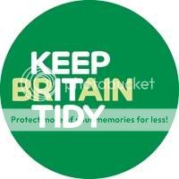
2009186_DW_keep2-1.jpg


Brand Catalyst creates new Keep Britain Tidy identity | News | Design Week
 
mmm dunno, the word BRAIN stands out for me. Unless they are also kinda saying "use your brain" keep britain tidy, dunno :icon_dunno:
 
Good point anyone else see that, noticed that someone has commented about that on the actual site feedback too
 
Honestly I prefered the older one......... it doesn't say anything, but everyone knows what it means.

I think they could have given that a face lift, and it would be still recognisable.

Just my 2 cents :icon_smile:
 
hmmm that's a good point I never thought of it as replacing the little man and the bin, that is a shame if its completely replacing it, is that the case?
 
Yea I found the man and the bin a little more encouraging. But the new one is quite clever, the only thing I would change is the size of the circle as somebody mentioned.
 
It's good but I also prefer the man and the bin logo. They've used green that maybe signifies the environment. Font is quite soft but maybe too soft, after all this sign is to get peoples attention. I'm waiting for the first person to say it's...rubbish!

Regards


Greg
 
It's rubbish! There you go!

No seriously, it's only 'ok' in my opinion. The old logo was so iconic and it just worked so well. Not sure why they felt the need to completely change it.

I think the green makes more sense, but I think the cream colouring on the text is a bit too subtle, I didn't see it at first. Might be my laptop screen!
 
I just think the use of text is a bad idea.... especially if someone cant read..... the symbol said it all.

Hopefully they will keep the little fella as well
 
I don't like this design now. Looking at it again I think it's quite weak.
Man putting litter in the bin, that was a brilliant idea and worked very well as a logo. They should have refined it.


Greg
 
hmm Not very keen..nice idea (I did see Brain first though) but the overall look of it, I don't like..not quite sure why the space is where it is...

Pauline
 
The Tidyman has not gone!

Don't worry, the Tidyman will still appear on campaigns, but as an anchor to campaign straplines, rather than as the organisation's logo. The original tidyman and bin was created by Anheuser Busch for its beer packaging, decades ago, and it has become a generic symbol for responsible litter disposal, used worldwide. It has now been refreshed for Keep Britain Tidy and given a new role in publicity campaigns, working alongside the new logo. The key to the new logo is the emphasis of the it in Britain, which means we can create more specific campaigns around the idea of Let's keep it tidy! and Help keep it tidy! Let's keep Bracknell tidy! etc
 
Hi,

Thanks for explaining the concept.

I think it needs more development. The copy lines aren't strong enough. It to signify Britain is quite a weak link. I think that it needs a more powerful message. Although a clever idea in principle the message has to be instant and I think more serious, like a road sign. Either no copy line or one word that get's the message across.

Regards


Greg
 
Back
Top