NEW business logo im working on

ldepty

New Member
Hey guys I'm working on this new logo for a business called Edoceo Solutions.. its a consultancy and training resource to the health/ voluntary sector.
I have been working with it all day and have 3 or 4 different logo's but i'm the most happy with this one.
Tell me what you all think, be brutally honest I'd love to get some advice from you guys on what else you think it needs..
THANKS
:icon_biggrin:

http://www.tumblr.com/photo/1280/11690839775/1/tumblr_ltd4wx7Ex11r0yy4y
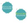
 
Quick first impression: don't think the symmetry is working or that the shapes and sizes are there yet and really don't like that old Mac font from the 80s.
 
I have to agree with Dave. Although the idea is there, it doesn't work how it is. The smaller parts just look like they're stuck there for no real purpose. And I'm not keen on the 'solutions' font, or the colour of it either. Keep both words in white.

Consultancy and training is one of those sectors that's pretty boring to design for. Most if not all have standard marks or shapes that serve no purpose - simply put there to say it's their logo. And because of this, most don't let you get really creative to find an awesome idea as they've got this idea stuck in their heads.

Keep working on it.
 
cheers for the feedback i really appreciate it,
I think your right about the shapes on the side. I have removed them and changed the 'solutions' font.
I think its working much better now... here's a shot of the amended logo's

which do you guys prefer.. colour or white?

http://29.media.tumblr.com/tumblr_ltde4mRkmC1r0yy4yo1_400.gif

Yeah its a shame its not the most exciting client but I just finished studying so Im happy to be working on anything :icon_biggrin:
 

Attachments

  • EDO-HEX(modify-4).jpg
    EDO-HEX(modify-4).jpg
    6.7 KB · Views: 12
The design with the extra colour has more depth. I'd still continue to work on it though. Different shapes perhaps.
 
Back
Top