Hi Berry,
Overall, a big improvement on the previous site, which was starting to look a bit dated IMO.
A few minor issues you may want to look at:
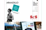
- Rachel is spelt 'Rachel' on the team page but 'Racheal' on the big quote photo.
- There seems to be a favicon (white A on black) for the Blog but not the main site?
- If I was a new visitor I might have some confusion over the name/identity, eg. the website URL is armadillo-creative.com (why haven't you gone with the non-hyphen .co.uk btw?
"62% believe a .co.uk address suggests a company is local or more relevant than a .com"), you then have the name/logo simply as ARMADILLO, then there's "thecreativedigitalagency.com" in the footer? Will this be part of a move to a new name?
- I think it would be good to have the sub-nav arrows appear on click of the nav items, as when I first clicked 'WORK' I was waiting for a new page to load or something more obvious to happen?
- Really like the big work images, just seems a shame you need to scroll to get to them on the Work pages, I think the team/quotes images work well on the homepage, but not convinced on having them on every page myself. I think the way the Blog is set out works better, it draws your eye down the page and into the content, wonder if something similar could be done with the work pages to have the same effect?
Hope some of that is useful, overall a big improvement

Greg

