

DarkPassenger
New Member
So I'm studying Graphic Design, and am not the best with type yet I must admit haha ")
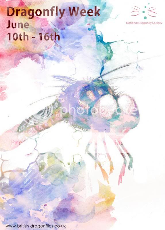
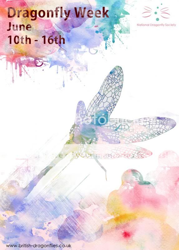
I'm just not feeling the type, its too bunched up in a corner for my liking, even the typeface doesn't feel right compared to the images/style to me.
Any suggestions would be great, Thanks!
I'm just not feeling the type, its too bunched up in a corner for my liking, even the typeface doesn't feel right compared to the images/style to me.
Any suggestions would be great, Thanks!