Need help with a logo.

Neptune730

New Member
Hello,
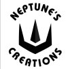
My name is Dennis. I am hoping I could get some help with a logo design. I am not a graphics designer at all. I have a Youtube channel I will be starting shortly. I am looking for help on refining what I have. I am willing to pay for help but funds are extremely limited and I don't know what to expect for fees. So what I have looks bland to me. But I really don't know. My Avatar is the logo in question. I think it needs some color. Maybe a background other than white. I was thinking some shade of Turquoise. The logo will be used for many different things. I would like to 3D print maker coins with it. Also make various size stencils. That is the reason for the stencil font. I will also be casting various objects in brass with the logo. One is a Wood Burning stamp. For items I want to mark where the text won't work well I will just be using the Trident in the center. So if there is anyone that can and is willing to help I would greatly appreciated it. Thank you for your time and consideration.

Dennis


NeptunesCreations.png
 
Welcome Dennis.

Playing the colours may help as the B+W look a little stark to me.

One thing I noticed is that on the "O" there isn't a bridge so you'd struggle to make a stencil from that.
I guess you could make a version for stencils and add that?

I think you need to look at the kerning as well to get the letter spacing to balance a little better.
 
Thanks for the input Scotty. Sorry I'm just now getting back with you. I have been real busy. When you talk about the kerning are you talking about balancing between the Neptune's and Creations? I think I see what you mean. I'm not a very artistic, so I find this a bit difficult. However I'm going continue to try. Thanks again.

Playing the colours may help as the B+W look a little stark to me.

One thing I noticed is that on the "O" there isn't a bridge so you'd struggle to make a stencil from that.
I guess you could make a version for stencils and add that?

I think you need to look at the kerning as well to get the letter spacing to balance a little better.
 
No worries. :)

Kerning as in letter spacing.

I just think it needs a little tweaking.
Try looking at it upside down.
It stops you from reading it and you see the shapes rather than the letters so it's easier to balance them.
 
Well as scotty said trying some color would help with the starkness :). Also the writing look off balance too heave low down may be your kerning font size or something ( Also as scotty said. )
I read that you chose the font for press reasons thats understandable but the main vector element is edgy and sharp while you have a rounded font, this makes it look to me like they dont belong together and the design breaks. Ofcourse this is only my opinion and im sure there are thousands of examples out there of round fonts and hard vectors but id take but theyre using something else to merge in a way.... It feels like something is missing here. ( isay that gringing a little because the last thing you want to do is add too much.....) have you any updates ? I dont think there is a correct anser just play around wit stuff like the angles of the tridents could maybe be it. Its a pity its going to be a sort of stamp you could do alot with shades on this. Sorry i did not have your font and this is very rough but maybe it can ive you some other ideas.asasasas.JPG
 
I think the logo would look better with the lettering in a full circle but with a better font and more spaced out. Be careful of the O as Scotty says.

This is not a great example as the bottom font is a bit too light, but it shows what I mean.
 

Attachments

  • Circular-Logo-Design4.jpg
    Circular-Logo-Design4.jpg
    118.2 KB · Views: 11
I'm reading everything that is coming in here. I appreciate the input. I'm looking at other fonts that may go better. I like the shape of the trident and don't want to change it. I see what you all are saying though. Like I said before I'm not artistic. I don't have any new iterations of the logo yet. I have a lot going on at once. Also I am not to familiar with using any software to create it. I'm watching Youtube videos on using Inkscape. I think I'm wanting this logo to be used for to much. I don't know. What I thought I would use it for was to be able to make a brass wood burning stamp, for wooden products I make. A one piece stencil I could spray over to leave my mark. I don't really see myself using it for that much at all though. Use it for my avatar. I plan on making a small maker's mark with just the Trident I can use to stamp metal parts. I almost forgot. Once I can get a final design, I will be having stickers made in the future. I don't have a problem in having several specialized "logos" for spastic uses. I welcome all input, good and bad.

Thanks,
Dennis
 
I don't think it needs to arc. I think it takes away from it.

I'd do a horizontal one with the icon either left or right - and do a stacked one, with the logo on top or bottom.

Fonts - do a bit of research - here's a link I got in about 2 seconds.
 
I have been playing with some ideas. I'm not sure what I think of them yet. What are your opinions? Here are a few.

g2616.png
 
I don't think it needs to arc. I think it takes away from it.

I'd do a horizontal one with the icon either left or right - and do a stacked one, with the logo on top or bottom.

Fonts - do a bit of research - here's a link I got in about 2 seconds.

I haven't looked into the horizontal one you mentioned yet. But I am open to still trying it. Though I think I would still like to stay with a round logo. Now referring to researching the fonts. I found a bunch on www.1001fonts.com that look good. I also looked at the link you mentioned. I liked a few but I didn't really see one I wanted to use. About the 5 examples. I thought the gradient would be something but I don't think it works to well. I think I will try some shadows maybe. If I'm wrong please let me know. Unless someone thinks the gradient works I think I am going to drop that idea. Thanks to everyone for the input. I enjoy reading it all, both positive and negative. So don't be afraid to be a little rough on me. But just a little ;)

Dennis
 
Ah you're fucking about with gradients when you should be getting the logo right.
You can add colour, gradients and shite like that after you get the logo right.

And for this - you're wrong on the logo circular vision.
 
Daaaaaaaamn I said just a little rough. LOL I would hate to see that abusive is.:LOL: I thought that color and gradients are all part of the logo? See I told you I don't know anything about Graphic Arts. Is this more of what you are talking about? Just real quick I need to get to bed.


test.png
 
You've gone from a nice, simple design that was almost there for what you need, to something that is really quite bad.

It's fairly obvious that you don't have an aptitude for graphic design and specially font choice, so why are you trying to do this yourself?
 
You've gone from a nice, simple design that was almost there for what you need, to something that is really quite bad.

It's fairly obvious that you don't have an aptitude for graphic design and specially font choice, so why are you trying to do this yourself?
So right. Because I can't afford to pay someone.
 
It needn't cost a fortune, specially for something fairly simple. I get that you don't necessarily need something that
looks professional, but just Google 'trident logo' or nautical/neptune logo and see what comes up - lots of simple but effective designs, much
like your first one. Then it's just a matter of choosing a smart, modern font, not something naff. Looking back, the one you posted with the yellow text
in the black box was ok, text just needs to be a bit bigger I think. No gradients, no shadows.
 
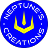
Well this is what I have. Unless It is getting better I'm done. I'll look into getting someone to design me a logo. I do appreciate all the input. It is not all lost. I did learn some things. I learned more about Inkscape. I already knew I can't design graphics.

g2616.png
 
Hey that is looking so much better. Well done.

Bit of advice - either thicken the lines in the yellow - or remove them - as in print these will likely break up being so thin.

Other than that - I really like it!
 
Back
Top