You are using an out of date browser. It may not display this or other websites correctly.
You should upgrade or use an alternative browser.
You should upgrade or use an alternative browser.
Need crits on social posters!
- Thread starter MA1
- Start date


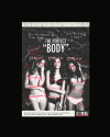
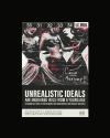
Posters should be quick get the message as you walk by - these need to be studied a little bit - would be ok for a magazine - but as a poster it's too busy, as already mentioned.
Thanks! How would you suggest making them less busy? Is it too much copy? I was thinking of splitting each poster into two, where the sans serif copy would be on its own poster, and the handwriting/image would be on the other.Posters should be quick get the message as you walk by - these need to be studied a little bit - would be ok for a magazine - but as a poster it's too busy, as already mentioned.
Thanks! How do you suggest making them less busy? I was thinking of splitting each poster into two, where one would solely be the sans serif copy, and the second would be the accompanying image and annotations.Yeah, a bit busy. Same as before really, image choice and font choice. Bit more punch.
It's probably because they are mostly black and white, but they look very dated to me.