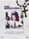
Hi! I would love crits on a teen horror film poster I made. It’s not a real movie, but it is a real book, which I’m posting the covers I redesigned for. Thank you!
You are using an out of date browser. It may not display this or other websites correctly.
You should upgrade or use an alternative browser.
You should upgrade or use an alternative browser.
Need crits on horror film poster!
- Thread starter MA1
- Start date


Wardy
Well-Known Member
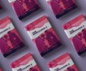
It's an ok start, but it needs a bit of work - it certainly doesn't have the punch of the book cover. Did you design the book cover, or is that someone else's work?
You need to come up with a different title design, you can't just lift it off the book and expect it to look right on your design.
It should be centred really, like the text below or at least have a reason to be range left.
More colour. More impact. Better and bigger crosses, blood etc. Photo at an angle maybe. It's just a little bit boring I'm afraid, it wouldn't catch your
eye if you walked past it. Maybe a better photo of the girl, the reason the book cover works is that the images are quite ambiguous.
Levi
Ultimate Member
Left design....
I'm having 'issues' with the difference in 'strength' of the necklace versus the picture. The idea, I assume, is to have the necklace laying on a notepad with the photo stuck to it, but they don't have the same sort of 'visual weight' like you would have when viewing in the real world so I'm being pulled to the necklace. The star and cross both look to clean as well, kind of think they should be 'hand drawn'.
Other than that, in all honesty, it feels like 'it's been done before' and like wardy said, it's a bit boring.
Hi Wardy! Yes, I designed the book cover, and wanted to try translating it into a film poster. I agree the book has more pow , for lack of a better term. Thank you for your thoughts! They confirmed my doubts.It's an ok start, but it needs a bit of work - it certainly doesn't have the punch of the book cover. Did you design the book cover, or is that someone else's work?
You need to come up with a different title design, you can't just lift it off the book and expect it to look right on your design.
It should be centred really, like the text below or at least have a reason to be range left.
More colour. More impact. Better and bigger crosses, blood etc. Photo at an angle maybe. It's just a little bit boring I'm afraid, it wouldn't catch your
eye if you walked past it. Maybe a better photo of the girl, the reason the book cover works is that the images are quite ambiguous.
Hey! Honestly yea, it looks super generic to me as well. I think I can get away with generic but the design needs to be stronger to back it up, l will definitely consider your ideas. Thank you so much!Left design....
I'm having 'issues' with the difference in 'strength' of the necklace versus the picture. The idea, I assume, is to have the necklace laying on a notepad with the photo stuck to it, but they don't have the same sort of 'visual weight' like you would have when viewing in the real world so I'm being pulled to the necklace. The star and cross both look to clean as well, kind of think they should be 'hand drawn'.
Other than that, in all honesty, it feels like 'it's been done before' and like wardy said, it's a bit boring.
Wardy
Well-Known Member
Well, it's probably the way they are presented, but it looks like the two were designed by different people. You need to apply the same basic design principles you used
on the book, to the poster design. That said, what works on a book cover may not work for a poster. You need to work on the main image I think most of all.
on the book, to the poster design. That said, what works on a book cover may not work for a poster. You need to work on the main image I think most of all.
There has to be some connect between the two.
They look completely different as products.
They look completely different as products.
Okay! I like that idea. I initially thought of applying the same visual language to the poster, but I noticed that lots of book-to-film adoptions have a different look between the book and film. I also thought to put more emphasis on a face/actor on the movie poster, so I’m hesitant to cut off faces like I did in the book. I might be overthinking it. Thank you!Well, it's probably the way they are presented, but it looks like the two were designed by different people. You need to apply the same basic design principles you used
on the book, to the poster design. That said, what works on a book cover may not work for a poster. You need to work on the main image I think most of all.
Is it okay to use the same word mark? To connect them?There has to be some connect between the two.
They look completely different as products.
Typically like these
Promotional designs for authors
Promotional advertising designs for your book, everything that a self-publishing author will ever need to help sell a book, banners, GIFs and much more
www.jdandj.com