Need advice on my portfolio

So I am sick of getting emails saying that I have not been selected for interviews. So I pressed on and asked "why", after three none answers I got an answer.

Hi

The work shown was largely in one style and we felt that your portfolio currently lacks some typographical & layout understanding which was demonstrated more fully by other candidates.

It was also considered that your portfolio did not demonstrate a high enough level of commercial awareness or varied skill set when compared to other, more suitable candidates.

Kind Regards

So yes......it seems that I am considered a one trick pony.....

Kayley Hill

(if people have looked at my website before, I have added the whole of the books I did to the daemon heart section now)

Can people give me some feedback on my portfolio and give me some advice how to get better and what I need to do to make myself seem competent.
 
To be totally honest, the feed back you got is right. There's no variety in your work it's all black and angry/mythical. On the whole it's a collection of one off logos which show very little exploration of your ability, variation or awareness of modern trends. Everything non logo based seems to be based around what could be mistake for the floor in a Greek hotel.

Now I've stopped being brutal...

You need to show prospective employers that your skills are diverse and commercially viable. By that I mean that you need them to look at your work and think "fuck yeah! What a great solution!!". Look around at whats happening in the world of design at the moment, which agencies are doing what, maybe even take on a of self initiated projects for a fictitious brand where you re-style the whole business, from logo, through shop fronts, carrier bags, marketing materials etc.. and make sure you showcase the whole package in your portfolio as a case study.

Also look at some big brands and give yourself a brief to work from. for example, "Facebook are looking to encourage young professionals to use their new facebookpro as a rival to linkedin. Conceptualise a range of marketing materials for the brand".
 
Mistake on a greek hotel floor?

Okay that line was pretty brutal to the point of being offensive....

I will admit I need more variety, but it almost sounded like you are saying all my work is a load of horse dung...
 
Mistake on a greek hotel floor?

Okay that line was pretty brutal to the point of being offensive....

I will admit I need more variety, but it almost sounded like you are saying all my work is a load of horse dung...

I made a typo (and didnt proof read my own post before clicking the button) and you then misread my typo. it said could be mistake for the floor in a Greek hotel but was meant to say could be mistaken for the floor in a Greek hotel.

for example, three pieces of your work:
daemon-book2_605.jpg

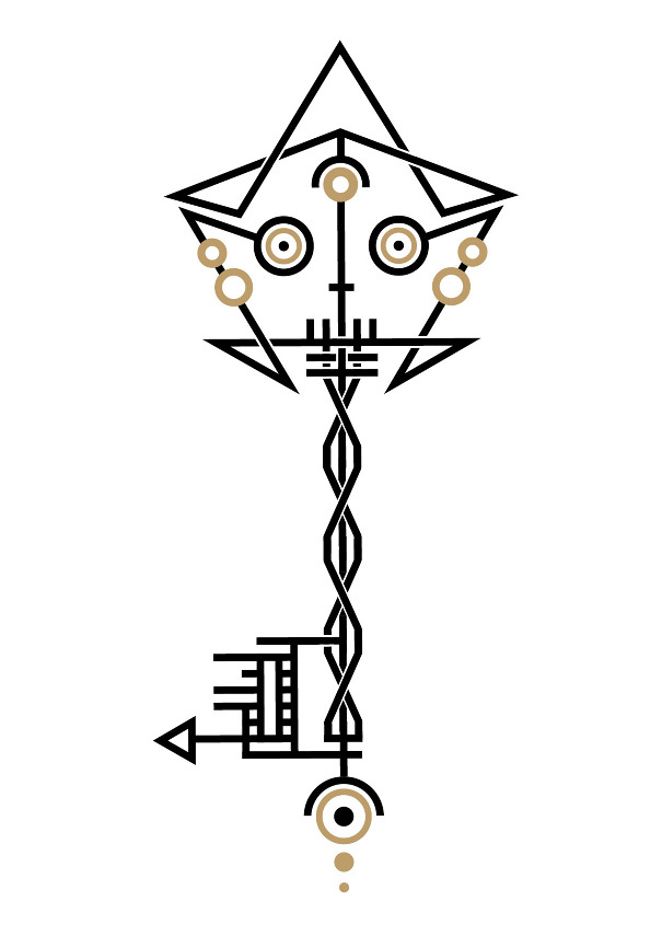
skeleton-key_605.jpg

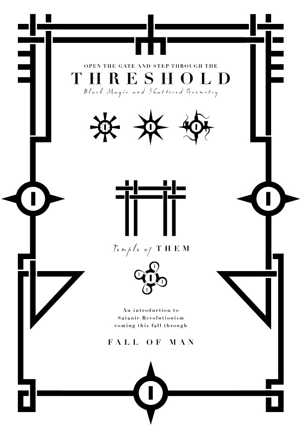
Threshold-flyer-revised2_605.jpg


Greek flooring:
PB5153.jpg


I have no interest in being offensive about your work and I'm sorry if you've taken it personally but you asked for a critique and that's what I gave you (perhaps we've both learned a lesson about proof reading here?).
 
I have no interest in being offensive about your work and I'm sorry if you've taken it personally but you asked for a critique and that's what I gave you (perhaps we've both learned a lesson about proof reading here?).[/QUOTE]

Tbh it was only that line that seemed offensive in that context, the rest I saw as good critique. Though tbh the three images you posted where all examples of one project (the key should not be in the other work section, my own mistake) and the threshold poster was commissioned from them seeing that book.
 
Hello

I mean absolutely no offense but the work does look very samey - as in the same style and genre; ultimately we have to appeal to the commercial world so you probably need to be looking at some examples of flyers, brochures, commercial logos etc.

It's such a hard call though, design is so very objective I've been told everything from 'amateurish' to 'amazing work' about mine; depends who is viewing and in what context but you certainly do need more of a range.
 
I agree with both of the above.

You have way too much of distinctive personal style going on there, from a particularly average header photo, all the way down to the photo of yourself. Too Gothic/black magic.
It would be fine as a blog or FB page for people who like that stuff, but not for mainstream graphics agencies.

Even the nice Arundel stuff is too monotone. Maybe use this logo and show it on a range of stuff, like Bigdave says, maybe a brochure cover with a nice colourful photomontage, for instance.

I would actually consider a separate website for the mainstream design stuff and keep Deadletter for personal stuff.
 
I am no expert as I'm still learning, and type is still my weakest 'skill' as yet, but I have to agree with the others. Your work is good in it's own way and would work in a folio if it was one project, and you clearly have skills, but it needs to be translated into a more varied folio of different projects.

How about creating a few self initiated projects or work for family/friends to build up a folio, which is what I'm currently doing. A range of commercially relevant designs from logos (and include a full identity set i.e stationery, etc as mentioned before), to flyers, leaflets, menus, posters, magazine spreads. I worked for a local print company briefly, where I learned a lot, and these are the things you'd be likely doing on a day-to-day basis.

You definitely need a splash of colour on your site and through your work as it IS very same-ish, dark and occult-ish.

Good luck with it all!
 
I really like some of your work, you just need to design a few projects that are for other people, were the style is more about what works for the client brief.
 
... the three images you posted where all examples of one project ... and the threshold poster was commissioned from them seeing that book.

That's quite telling, I think: if someone wants something in your style, you're clearly the place to go; if, however, someone wants something in a different style or wants to see a range of styles to help them make up their mind, there isn't really any evidence in your portfolio to suggest that you'd be up to it (that's not to say that you aren't up to it, of course). As has been echoed above, then, you got some useful, constructive feedback there...
 
When you have only been trading for a short period of time, building your design portfolio can be a bit of a nightmare! The best way around this is to take on some pro bono work for charities and community groups. I'm sure you have some groups in your local area that could really do with a new website or print design, offer your services for free and this will get you a variety of portfolio pieces for real life organizations and make your portfolio a lot more varied. Hope this helps.
 
I kinda been working on a couple of things which lifted my spirits.....then I just had feedback from an interview from what can only be described as my dream job. It is disheartening as I feel like I am crap and that my years in uni where a waste of time and money.

But I am going to do more varied projects and try to challenge myself again.
 
Back
Top