Need a Little Layout Advice

lukie934

New Member
Hey guys,

I am fairly new to this forum and working on some presentation boards for my course about my work process (not assessed or graded!). I am not a graphic design student but we have been informed that these boards have to graphically reflect us as designers, a task I am finding challenging.

The following board have something off about the layout and through numerous attempts at rearranging I cannot seem to put my finger on it.

Any advice or suggestions would be great!

Kind regards,

Lukie
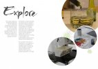
Explore Page V2.jpg

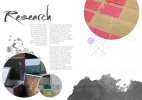
Research Page V2.jpg
 
Hi there, interesting layout, however a few things I would tweak:

- Heading font
- Remove grunge texture / paint splats from all images
- Consistency for the large image at the top-right to exceed beyond artboard
- Perhaps the measuring circles could replace the grey smoke effect?
- Left-align all text, perhaps justify them (without the hyphen breaks) and even columns

You could keep the presentation boards interesting by having every other artboard with the images on the left and text on the right.
 
Hey,

Thank you for the reply I will try those adjustments out. The layout was a slight concern for me do you think it is well balanced?
 
The balance between text, images and 'white space' is more than effective - once further improvements have been made.
It's not necessary to fill up the spaces... the use of 'white space' can be good design, if in the right context.
 
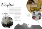
I'd do something a bit like this, keeping the text to one side and the image to the other to balance the spread. I'd drop the grunge textures too, they're pretty dated and just add clutter to the page.

Explore Page V2.jpg

For the first block of text on each spread, I personally wouldn't align them to the right like you have done as right-aligned text is actually quite hard to read. I get what you're doing by having a nice clean line between the columns, but you could get this by justifying the type (though you need to know what you're doing with type to get justified text looking good). You could put the first block in a bolder weight to give that section some extra emphasis over the other, giving the reader a clear starting point.

I'd also play around with a different font. Currently you're using a serif which is typically used for longer columns of text, and has a certain feel to it that I don't think sits well with your scrawled headline. A sans-serif such as Univers is good, though it's not a font that's freely available.
 
If the layout is meant to "graphically reflect us as designers" what are you trying to convey?

Just a thought.

I'm presuming what there asking for is an artists statement or something along those lines.
If you interested look at David Carson's CV showing more of his style than keeping to traditional layout format.
Obviously this is an extreme example but I think interesting all the same

http://www.pearsonportfolio.co.uk/assets/2013/12/David-Carson-CV.jpg
a piece of his work
https://jonskibeat.files.wordpress.com/2011/08/david-carson.jpg
 
Back
Top