

GibbonIt
Member
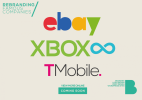
Hi Guys
On the rare occasion I get some spare time, I love to experiment with fictitious icons and brands to work with new skills. After seeing news and rumours about the new ‘Xbox’, apparently to be named the Xbox Infinity or the Xbox Fusion, I thought I could experiment with a possible brand for it. That later developed to me working with other famous brands on logos that I thought could be improved.
Here’s the breakdown;
EBay.
Look. I think the recent rebrand and modernisation for the EBay brand was necessary, but they ruined the fun! How could they… So I kept the clean and minimal design, but tried to jazz up the design with some fun

XBOX Infinity.
I decided to work with the Xbox Infinity idea, as being blunt, it’s a better name. I got inspiration from a few great designers on dribbble for colour and positioning choices, but executed it in my own style. I’ve used ‘Infinity Blue’ for the infinity symbol, and the traditional green xbox colour for the name itself.
TMobile.
Their current logo isn’t good, it isn’t okay, it’s terrible. It seems someone simply typed out the word in a horrible font above a dotted line. But as the brand has developed the colours have defined the brand along with the square(s), so I went for a new font and kept the famous square as a full stop at the end of the word mark.
What do you think about these designs?
From my blog post here.
On the rare occasion I get some spare time, I love to experiment with fictitious icons and brands to work with new skills. After seeing news and rumours about the new ‘Xbox’, apparently to be named the Xbox Infinity or the Xbox Fusion, I thought I could experiment with a possible brand for it. That later developed to me working with other famous brands on logos that I thought could be improved.
Here’s the breakdown;
EBay.
Look. I think the recent rebrand and modernisation for the EBay brand was necessary, but they ruined the fun! How could they… So I kept the clean and minimal design, but tried to jazz up the design with some fun
XBOX Infinity.
I decided to work with the Xbox Infinity idea, as being blunt, it’s a better name. I got inspiration from a few great designers on dribbble for colour and positioning choices, but executed it in my own style. I’ve used ‘Infinity Blue’ for the infinity symbol, and the traditional green xbox colour for the name itself.
TMobile.
Their current logo isn’t good, it isn’t okay, it’s terrible. It seems someone simply typed out the word in a horrible font above a dotted line. But as the brand has developed the colours have defined the brand along with the square(s), so I went for a new font and kept the famous square as a full stop at the end of the word mark.
What do you think about these designs?
From my blog post here.
")