My Own Logo

Tony Hardy

Well-Known Member
Hey everyone.

I'm looking for some feedback on my own logo that I've designed for me, as a designer/motion graphics artist/animator. I plan on using my full name for trading, Tony Hardy, hence the initials.

My work is all about simplifying ideas and communication down to the core, so I applied the same theoretics to my logo. I'm also keen on adding tiny bits of texture to my work, which is where the broken paper texture came into it.

What is a logo? A stamp, an icon, a shape, that's recognisable. This is what I've got so far and would love some feedback.

Sorry that there's no variations of this, it's all just different colours etc. I'm going with black and white for now.

Cheers
Tony
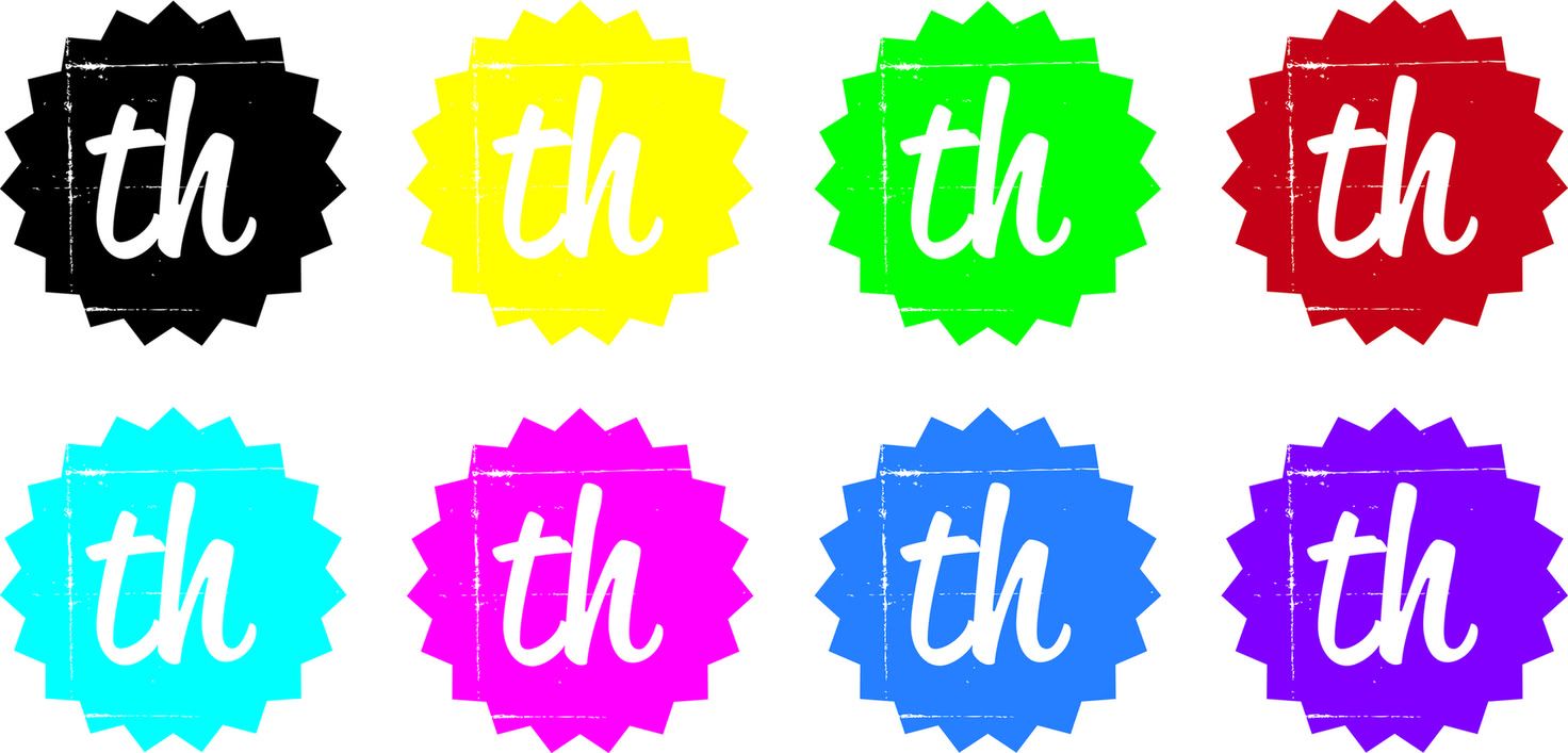
logocomp.jpg
 
I like it to be honest!

I think that it looks a little different by using the texture, it isn't something you see all that often but I think you've executed it well; it looks smart.

The type looks good and I think that choosing the handwritten style font is appropriate, particularly when it's your own initials so I think that it's a good choice.

Not sure which colour I'd choose but I suppose that can be a versatile aspect depending on where the logo is - different colours for different places!

Like you say, it can be seen as a stamp and I think if you take it as a stamp then you've pulled it off well, I'm a fan.
 
I'm okay with the font and the stamp but I don't think the squared stamp lines sit well within the star shape (they don't look like they have any relationship with one another).
 
Yeah that's the one thing I was sure on Dave L. I might play around with the positioning of it a little more. I think it may make the text seem a little low.

Thanks for the kind words Dedwardp :)

I look forward to seeing other peoples work and helping with C+C etc.
 
Hey everyone.

I'm looking for some feedback on my own logo that I've designed for me, as a designer/motion graphics artist/animator. I plan on using my full name for trading, Tony Hardy, hence the initials.

My work is all about simplifying ideas and communication down to the core, so I applied the same theoretics to my logo. I'm also keen on adding tiny bits of texture to my work, which is where the broken paper texture came into it.

What is a logo? A stamp, an icon, a shape, that's recognisable. This is what I've got so far and would love some feedback.

Sorry that there's no variations of this, it's all just different colours etc. I'm going with black and white for now.

Cheers
Tony

logocomp.jpg

I like it. I'd shy away from the bright neon colours IMHO tho, as I think they look a bit "New Improved" unless that's the feel you're trying to achieve? Black and white is good but I think it may have limitations when/if used in print. I think it'd have to be a fair size to see your "broken paper texture" in any detail without it looking like dodgy printing. Maybe something to consider?

HTH
Dave
 
Thanks a lot Dave.
I'd been thinking about the printing, that maybe I'll print onto some sort of texture material with a plain shape. I'm not exactly sure what/when/if I'll be having anything printed out yet. I'm assuming the answer to that will eventually be yes.

Colour wise, I'm just going with black and white I think. It's a safe bet and looks professional I think.

Can also be inverted and used on different backgrounds where necessary which will be useful.
 
Another point that I'd forgotten all about. Indeed. I'm sure there'll come a time when I remember I can do just that.
The other think with leaving it black and white, is I always have the option to go for a colour when the moment comes, or the black one just isn't doing it for me anymore.
 
Thanks a lot Dave.
I'd been thinking about the printing, that maybe I'll print onto some sort of texture material with a plain shape. I'm not exactly sure what/when/if I'll be having anything printed out yet. I'm assuming the answer to that will eventually be yes.

Colour wise, I'm just going with black and white I think. It's a safe bet and looks professional I think.

Additionally you may want to think how the "th" will be viewed on coloured backgrounds other than white. For instance, will the letters always be white or will they knock-out to the background colour.

Part of my prep is trying to imagine as many possible configurations for the logo. Lovely intricate swirly designs may look great on the web but what about if your client (i.e. you) get all corporate and have embroidered clothing, vehicle liveries, profile cut signage - will the design be too complex for these applications?

Also orientation is a consideration. Although your logo is relatively proportional a lot of corporate logos can have more than one treatments to suit differing applications. For instance, a portrait, tall logo won't suit the top of a letter head.

In my opinion designing a logo should be as future-proof as possible.

Hope my ramblings help. :icon_wink:

Dave
 
Dave (BlackBinLiner),

Your ramblings indeed are very helpful :)
I've not thought about the future as such in the direction of embroidered shirts and van signage, but I guess it's something for me to consider.

I think if I ever went 'corporate' I'd be past myself thinking 'oh dear, I've expanded and must be doing quite well'. Not something I've envisaged before. I think I'd be more likely to go for screen printed black on white tshirts.

And, I made the decision a while back about knocking out the text. I'm always going to have the white text, but the logo shape won't be encompassed with a white square, that's always going to look quite punched out.

PNG's for saving the transparency are great :)
 
Back
Top