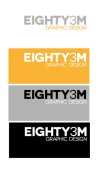
My logo

MJ96

Member
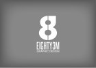
Well....it's taken a while but i've at last round to create my own logo! I'm happy with the name as it's easy to remember, rolls off the tongue and is personal to me.

This is only the first design but I'm really interested in what you guys make of it. Away you go!!

Thanks
 

Attachments

  • My-logo.jpg
    My-logo.jpg
    17.3 KB · Views: 118
It makes me think of sticky tape (because of the 3M bit, and they use similar colours on some of their products). I dunno, it doesn't exactly make me recoil in horror but it doesn't make me sit up and take notice either, I think it needs further development, maybe... Oh I wish I could be more constructive for you.... it's getting late in the day, I'll have a think and get back to you x
 
It makes me think of sticky tape (because of the 3M bit, and they use similar colours on some of their products). I dunno, it doesn't exactly make me recoil in horror but it doesn't make me sit up and take notice either, I think it needs further development, maybe... Oh I wish I could be more constructive for you.... it's getting late in the day, I'll have a think and get back to you x

It does look a lot like something you'd find on the side of a tape measure in B&Q or something like that. Like Linzi said though, it's not offensive but it doesn't grab your attention.

Designing for yourself is the hardest project going.
 
It certainly is! But I feel it's a good start and I completely agree with the 3M comments, appreciate it guys. Probably the best road to take would be to replace the number 3 with the word and see where it goes from their.
 
What font are you using here? The E and G look to have that blocky, slightly unattractive finish you find with a lot of freebies...
 
Very tough doing your own logo, took me ages and Im my biggest critique ... I too am not liking the font that much, try a few more font variations. I also asked a few friends to pass my logo around where they worked just to get some general feedback, which helped out alot.
 
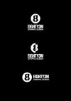
Thanks Steven. The design has since moved on, with the help of feedback provided I've moved the focus onto a symbol to move away from the 3M association (at least in terms of design). The symbol incorporates all elements of the name and works well enough on it's own I feel to work across a broad range of media.

I'm quite happy with how it's going but would love to hear what you guys think.

Thanks
 

Attachments

  • photo.JPG
    photo.JPG
    52.1 KB · Views: 51
Thanks guys, really appreciate the likes!

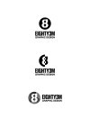
Also attached are a couple of other versions for use when nescessary.
 

Attachments

  • my logo -05.jpg
    my logo -05.jpg
    63.9 KB · Views: 20
  • my logo -04.jpg
    my logo -04.jpg
    88.2 KB · Views: 29
It's loads better but, if it were me, I'd possily have another think about the squaring-off (top-right) as my first instinct was to see a lowercase 'g' (that said, the effect is lessened somehow in the greyscale options).

Nice work, though.
 
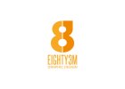
Thanks Dave, definitely see where you're coming from. New colour version attached with the centre split in.

This breakup certainly helps it dissociate from the 'g' but I'll keep looking at other possibilities.
 

Attachments

  • my logo orange -03.jpg
    my logo orange -03.jpg
    87.5 KB · Views: 34
Love the design.

Hate to be a kill joy but there is a few similar out there within the same industry? Make cause a few problems further down the line.

https://www.google.co.uk/search?q=8...PKif0QX27IGwBA&ved=0CB4QsAQ&biw=2560&bih=1319

i must say from looking on that search i LOVE this logo

p83logo.jpg
 
Thanks for the heads up, Something to bear in mind. Hopefully mine will have enough about it to stand out but as I said before it ain't half hard designing for yourself!
 
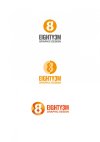
Ok, so I'm still not convinced with what I have produced so have made a few tweaks and attached a few for you guys to look over.
To see how these logos work in context, I've tweaked my existing invoice and added each of the logos attached on the post below.

I'm a lot happier now, favouring the top logo especially when used on the invoice but am really keen to get some constructive feedback.

Cheers
 

Attachments

  • Eighty3m updated logos-01.jpg
    Eighty3m updated logos-01.jpg
    65.6 KB · Views: 17
  • Eighty3m updated logos-03.jpg
    Eighty3m updated logos-03.jpg
    80.3 KB · Views: 14
  • Eighty3m updated logos-02.jpg
    Eighty3m updated logos-02.jpg
    80.1 KB · Views: 14
...and the invoice mock ups.
 

Attachments

  • Invoice mock ups3 12.21.24.jpg
    Invoice mock ups3 12.21.24.jpg
    37.7 KB · Views: 18
  • Invoice mock ups2 12.21.24.jpg
    Invoice mock ups2 12.21.24.jpg
    32.6 KB · Views: 13
  • Invoice mock ups.jpg
    Invoice mock ups.jpg
    75.5 KB · Views: 20
Back
Top