My Graphic Design business logo? Opinions..

I've found trying to design for myself is by far more difficult than for any client. Louise Amber Graphic Design is quite a long title and I've struggled for an icon idea to focus on etc.

Almost all ideas aren't going to look original as sadly most of it has been done before.

I appreciate the input though and I agree ha.
 
Designing for yourself is every designers achilles heel, it is very difficult. But it does look generic, and I wonder how it would work in black and white, due to the shading, highlights and gradients you have going on.

It would be better if you designed something far more simplified and personal to yourself or business.
 
Almost all ideas aren't going to look original as sadly most of it has been done before.

This is bullshit, there's still plenty of originality to be found and anyone who preaches "there's nothing original left" is just lazy and making excuses.

The trouble is you've designed a mark that doesn't mean anything, it's just a geometric with some trendy shading applied, and thus looks like a lot of other half-arsed identities. Ditch the mark, just stick with your name and spend your time and energy on finding more clients. You'll be surprised how many simply don't care that you don't have an identity. So long as you have some decent examples in your portfolio you'll be fine without your own.

If you really feel like you must have one, think bigger. Think 'branding', not 'logo'. The medium for logos is changing, so have fun and think about how you can animate a mark or utilise digital technology to produce something that's not just a static shape you'll probably align to the left of your name and print on a business card.

For example, the Slack logo is nothing revolutionary, but it's so simple that it can be used in a few different contexts, for example, as a loading animation within the app itself…

https://d262ilb51hltx0.cloudfront.net/max/800/1*Zt4D8uCy5-J82hw-rHsJxA.gif
 
Thanks for the input Paul, believe me it isn't laziness that led me to the current logo. I went through many, many ideas through sketchboards, the lot.

My previous logo was one similar to yours, I think I had Bebas Neue as my logo font.

I'm going back to the drawing board, going to try and go for something more branded, simple and cheers for the idea at the end.
 
Thanks for the input Paul, believe me it isn't laziness that led me to the current logo. I went through many, many ideas through sketchboards, the lot

Just to clarify, I wasn't implying that you were lazy, just that people claiming "their's nothing original" are. Don't listen to them because they're defeatists.

Being original and looking different are not the same thing. Two things can look or work in similar ways, but still be original in some other way. Netflix for example, allows people to pay a subscription to watch TV shows and films. Nothing original there. Sky, Virgin, etc have been doing that for years. Yet Netflix differs by allowing customers to opt-in and out of the contract at any time, producing and showing original, high quality content without adverts or interruptions, across devices, all for a ridiculously low price. No install fees, no set-up costs, no waiting in for visits from engineers.

The cable and satellite providers can't compete with that, and as such Netflix is actually revolutionising the way consumers watch TV and films. They still effectively do the same thing as the cable and satellite providers, but they're doing it in an original way, which is why it's so revolutionary.

My previous logo was one similar to yours, I think I had Bebas Neue as my logo font.

Check out the logo in context – COSMOS | Website Design & Development Manchester. It should be animating, though I haven't check across-browsers so you might see something completely different!

It's not a particularly amazing or 'original' design by any stretch of the imagination, it looks ok on paper and certainly works as a logo, but isn't particularly ground-breaking. I struggled with coming up for something for so long, and it wasn't until I realised I was now able to animate a logo that I realised there was a whole new door opened up for branding opportunities.

Now when I'm designing identities for others, I always try to at least think about how it can animate or be used as an animation (like that loading icon example) to reinforce the brand and inject some originality into. Not everything has to animate, but it's worth future-proofing your designs as much as you can.
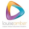
 
Just backing up what others have said really but it does look like the kind of thing that can be downloaded as a business logo from stock image sites (you know the kind of thing: "your business name here").
 
Hi,

Agree with the previous comments. You don't necessary have to use a mark to create a logo, a nice font and some typography can always work. I don't mind the mark you have used, I would maybe reduce the amount of colours and refine the shape.

Creating a personal logo is always a huge challenge, I've been there and found that I'm very self critical of my work. Try making it a bit more personal and almost treat yourself as a client, take a look from the outside in. What is it you want to say about yourself? What is it that makes you different?

Hope this is helpful.
 
Back
Top