You are using an out of date browser. It may not display this or other websites correctly.
You should upgrade or use an alternative browser.
You should upgrade or use an alternative browser.
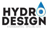
My first logo for a client!
- Thread starter CarterDesign
- Start date
PrintME
Member
So guys, this is the first logo i've done for a paying client. its not the hardest thing to do but i've only been usuing illustrator for less then a month now!
*this is just a jpeg version for an example*
Please let me know what you guys think.
View attachment 2538
First off great attempt for your first logo. I would expanded your type so it's all the same width as it looks like you've clicked a button and centred everything like people do on word. think about making the hydrographic specialists bold as it seems lost against the rest of the text. For the 'O' symbol have you thought about trying to make it more 3D?
CarterDesign
New Member
Thanks for the advice, 3d is the option i havent really dove into as of yet but im looking into it
@GCarlD
Well-Known Member
I agree it is an ok attempt considering this is your first logo. You've got quite a nice idea with the water drop and the 'o' but the whole thing needs to be executed properly. As a designer it pains me to look at, as the kerning and composition is just horrific. You say it's not the hardest thing to do and I can see why - it doesn't look like you've spent much time on it. Going on from the MS Word comment above, it really does look like you selected a font, typed everything out, hit central alignment and that was job done. When you are designing a logo, ideally you want to use a more inspiring font, a font that not any tom, dick and harry would have pre-installed on their pc/mac. You then want to take care of the typography, have a nice layout and correct composition. These are just some of the basics of not only logo design but design in general.
But as I said, it is a good start for at least showcasing your idea.
But as I said, it is a good start for at least showcasing your idea.
CarterDesign
New Member
Thanks a lot buddy, very nice points you've brought out and i can see exactly where you're coming from, still getting the hang of stuff as of now, and the font isnt a pre-installed font by the way 
other then that, thanks for all the constructivness and i'll try better on the next one
other then that, thanks for all the constructivness and i'll try better on the next one
CarterDesign
New Member
Yeah I knew that probably weren't a pre-installed font but there are similar fonts like that pre-installed. But you get where i'm coming from anyway.
We all had to start somewhere and you are heading in the right direction creatively. Keep it up!
Like you said, everyone starts somewhere
Thanks buddy
