My first ever freelance job...I really need help

Design.Soldier

New Member
hi, this is my first ever logo design for a client, i have designed the logo according to their requirement's and wants, they are a suit company. but in terms of presenting this logo to them and putting it onto their business cards and what do you feel it the best option. This might seem slightly OCD and crazy but i think i might be over thinking it and its just driving me crazy. please help me decide what colours to uses and the pro's and cons of what i choose. also, let me known if im being over critical and just annoying.

thank you so much for helping me and taking the time to answer.

Screen Shot 2012-09-08 at 23.29.09.jpg
 
Is there any way of uploading a higher res image? From what I can see the design looks really good and you may be being too harsh on yourself. But I have the same sort of problem though, especially with logos. Try not to offer the client too many options, probably no more than 3 from my experience.
 
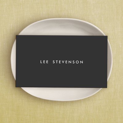
For something like a business that supplies suits (luxurious, formal and smart) I'd keep it really simple. Black type and logo on a thick white or off white stock would be nice, though I'd personally go with white on black.

Something like this...
simple_minimalistic_black_business_card-p240760176117138083en8om_400.jpg
 
^This. I also think the thin lines you're working with require the kind of contrast you're not getting with black and red.

Do offer three or so options but make sure they're all good: nothing worse than throwing in a half-arsed option to make up the numbers only for it to be the one they choose and, therefore, the one you have to work with.
 
I find the red background too strong and intimidating. Try placing the logo on a plain black or white background. Don't use a gradient. Simple is good. :)
 
Back
Top