You are using an out of date browser. It may not display this or other websites correctly.
You should upgrade or use an alternative browser.
You should upgrade or use an alternative browser.
My CV- what do you think?
- Thread starter matty1491
- Start date


matty1491
New Member
TomStutt said:cant see it. too small
You clicked on it? Here is a direct link:
http://sphotos.ak.fbcdn.net/hphotos-ak-snc3/hs483.snc3/26445_1373787337405_1013439489_31121105_3299662_n.jpg
ralphsaunders
Senior Member
Can't see it. Too small. Even with the direct link.
Even though the image is small the fact that the your name is in huge type to me is is a good point, it shouts to the person reading it meaning they won't forget your name too soon. Other than that the only thing that i can see that may be a problem is the note additions, while they are a fun extra it all depends on who reads the CV and what mood they are in. The additions may injure your chances rather than help.
Renniks
Senior Member
JamsBlah said:Even though the image is small the fact that the your name is in huge type to me is is a good point, it shouts to the person reading it meaning they won't forget your name too soon. Other than that the only thing that i can see that may be a problem is the note additions, while they are a fun extra it all depends on who reads the CV and what mood they are in. The additions may injure your chances rather than help.
while this may be true, it depends who you want to work for. Dont sell yourself short if you feel this is who you are, then put it in and just be proud of it ... if it's not who you are and just for that bit extra, then don't be silly

IMO when I look at this my thoughts are that the hand written bits look like they are going to be amendments, this is how I get work put on my desk with amendments on. I think the layout is good but I think maybe the hand written bit should be in some cool speach bubbles maybe??
iain_darkflare
Member
Hi Matt,
Is that not just an edit of the one Sam Brown did for the Smashing Magazine article? If so, then it is likely that a lot of creative agencies will have seen it, and personally I don't think that would reflect well.
By all means take inspiration from it, but if it was me, I would rather design my own CV. Chances are there could be a lot of other people submitting similar looking CVs and it won't stand out.
Iain.
DeanZappy
Senior Member
Is that not just an edit of the one Sam Brown did for the Smashing Magazine article?
Yeah thats what I thought, Im pretty sure that is just an identical copy, with the text changed obviously.

DeanZappy
Senior Member
In my opinion you need to tone it down!
1. Lose the picture, don't really think you need it, plus the effects seem abit tacky.
2. There is no space for any of the text to breath, everything seems crammed in doesn't read very well.
I would start by setting up a document in InDesign with a decent grid, get everything laid out nice and clean in black and white first. Then you can start adding design elements, colour etc.
Also if you are going to be printing this I don't think the colours would reproduce very well at the moment.
matty1491
New Member
DeanZappy said:In my opinion you need to tone it down!
1. Lose the picture, don't really think you need it, plus the effects seem abit tacky.
2. There is no space for any of the text to breath, everything seems crammed in doesn't read very well.
I would start by setting up a document in InDesign with a decent grid, get everything laid out nice and clean in black and white first. Then you can start adding design elements, colour etc.
Also if you are going to be printing this I don't think the colours would reproduce very well at the moment.
Ahh ok, thanks for the advice
Its prints fine on a Xerox Docucolor, but might change the colours round a bit so it prints well on my inkjet!
iain_darkflare
Member
I agree on the picture...don't include on unless it is requested.
I'd add more space at the sides too. While I would tone down the colours, I do sense that this is more "you" this time, which is good.
It's definitely a lot better than the word template CVs I get sent.
I'd add more space at the sides too. While I would tone down the colours, I do sense that this is more "you" this time, which is good.
It's definitely a lot better than the word template CVs I get sent.
iain_darkflare
Member
Good question...I've yet to receive one. Although I have no need to employ anyone, and find it funny that people send them to me.
I am personally not a fan of CV's on an angle, or ones that are too "graphic-y", I'd rather see one that is clean, crisp and well laid out. One that I can scan quickly for info, but still ahs a touch of personal flair to it.
I also think that it is important to tailor each CV to each position and company that you apply too, equally important is the cover letter. Not too long, not too short, and when possible address it to someone.
A case in point, last night I received an eqnuiry via my website that was sent to Dear/Sir Madam with no CV and no link to a website. Now I am not looking for anyone, but if I had been I wouldn't have been overly impressed as my site does state that Dark Flare is a personal design service from me.
berry
Active Member
I get lots of CV's either by post or email, very few stand out, all get kept on file - unless their numbnuts.
What I like to see in a CV is:
1. Intro letter or email correspondence, well thought out, personalised, and relevant to my agency. I need to know why you are contacting me, why my agency, and why I should consider you. If it doesn't then I very really read the CV attached.
2. In The CV, I want information ( not design) I would like to see the CV well designed and style with good use of typography. Anything over-designed get's binned.
3. The layout and clarity of information will demonstrate to me that you know how to solve a creative problem. It is problem solving not design.
4. I need to see a small selection of work that is incorporated into the CV pdf.
5. I need to see a web link to portfolio and clear contact details.
6. I need to see that you understand me and my agency and that I must peak to you.
7. I need to see someone who is separated from the crowd.
Dont want to see a pix unless its a happy inspiring pix!
Becky
Member
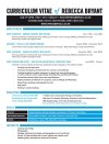
It stands out, and I like the idea behind it... but it looks a little too "Photoshoppy". While I agree it should stand out from other designers. It should still be easy on the eye and easy to print out for reference imo. (Should you be sending it by email).
I've recently redone mine and had positive feedback (I had an email within 30mins of sending it, can't be bad It's not the most original, or outstanding. But I'd like to think it's a little more interesting than the "norm" without being too outrageous. I've only attached a copy of my CV. But I send it out wire bound with an A4 copy of my portfolio and a personalised introduction/cover letter and a business card. As well as having a PDF copy for emailing
(I've pixelated some info out)
I've recently redone mine and had positive feedback (I had an email within 30mins of sending it, can't be bad
It's not the most original, or outstanding. But I'd like to think it's a little more interesting than the "norm" without being too outrageous. I've only attached a copy of my CV. But I send it out wire bound with an A4 copy of my portfolio and a personalised introduction/cover letter and a business card. As well as having a PDF copy for emailing(I've pixelated some info out
)Attachments
Renniks
Senior Member
Not got much time to comment, however I feel its a poorly executed similar thing to Typographic Resume by ~mac1388 on deviantART (just my 2c)