You are using an out of date browser. It may not display this or other websites correctly.
You should upgrade or use an alternative browser.
You should upgrade or use an alternative browser.
Mascot + Business Cards
- Thread starter Wee Jimmy
- Start date


Thewholehogg
Active Member
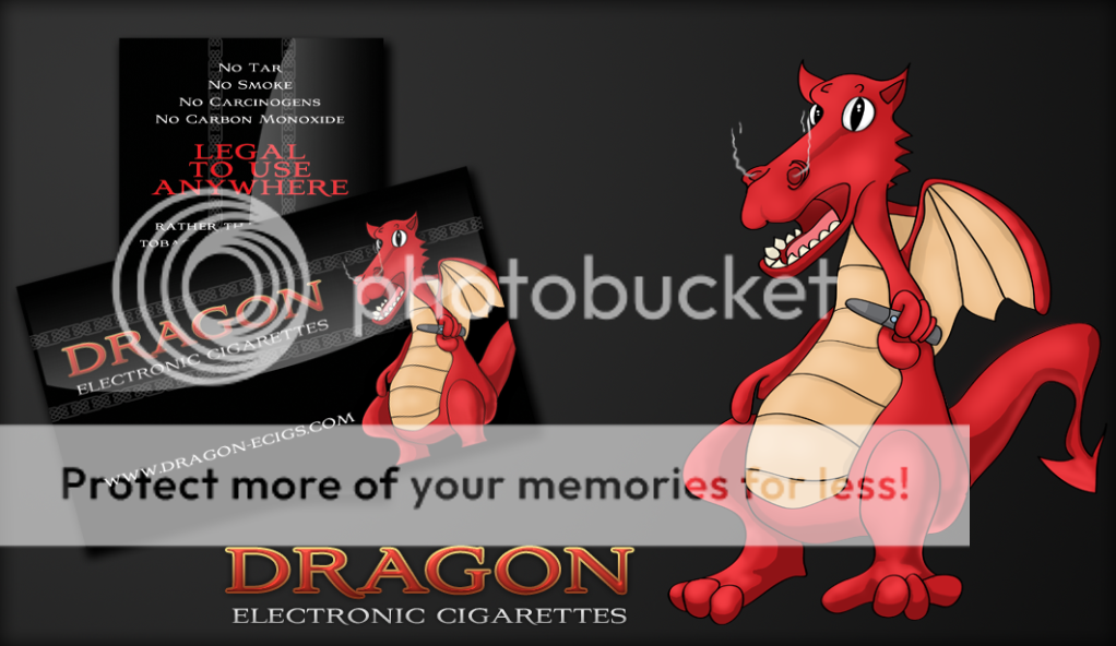
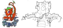
The dragon could do with a bit of work. I like him but he looks a tad stoned.
BenJonesDesign
Active Member
Typo's right, I think it's the way he's slouched back and not sure about the smoke thing as it sorts says there's smoke in that electronic cigarette?
Jimlad
Well-Known Member
I'd start again with the dragon. I like him but he looks shocked, his feet need work, and the ecig looks a bit suggestive when coupled with his face. I'd either exaggerate the size of the ecig to make it more prominent (it IS the product after all) or not use it at all. You could either do more with the smoke, since the ecig produces none haha, or remove it altogether for the same reason... I'm also a bit dubious about the gradient on the cards, it looks sleek but might interfere with its readability. I like the colours though.
C
chrismitchell
Guest
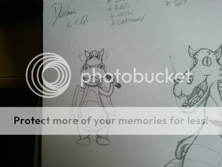
now thats one funky pipe ")
Jimlad
Well-Known Member
I think it might be worth re-drawing the dragon, perhaps have the pipe in his other hand so it forms part of the silhouette and have him look like he's enjoying it more. He still looks like he's being electrocuted. Could have his head facing the writing and tilted up a touch, all sophisticated like. I'm now thinking how did the pink panther used to look with his cigarette holder haha.
BenJonesDesign
Active Member
Jims right, I think perhaps add some more expression using the eyes, add some eye lids slightly covering the eyes with the eye drawn up slightly, that should give a relaxed expression, but maybe that might make him look high again :S
Thewholehogg
Active Member
Sounds like a plan.
Thewholehogg
Active Member
Also just one point. The product is electro cigarettes. Er, he has a pipe?
Wee Jimmy
Senior Member
Jimlad said:My fault, I suggested it after watching the vid posted earlier. Might be safest to return to the ecig tho if the company don't do epipes.
Custom made E-Pipes will be part of the product list so the pipe can still play for that category. Still working on some changes
Thewholehogg
Active Member
BenJonesDesign
Active Member
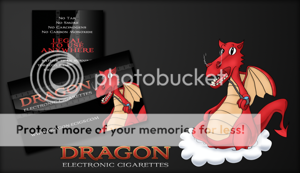
latest looks good jimmy, looks like hes proud to smoke it, a good pose and expression, last thing I would add to the expression is a smile line to the side of the mouth