You are using an out of date browser. It may not display this or other websites correctly.
You should upgrade or use an alternative browser.
You should upgrade or use an alternative browser.
Looking for crit on logo designs.
- Thread starter theking79
- Start date


pangolin
Member
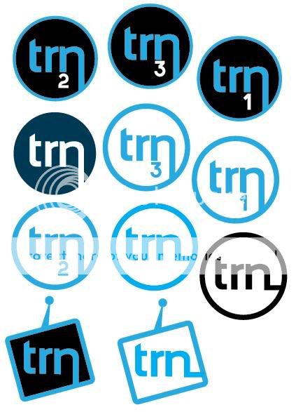
I'm not an expert but my personal favourite is the blue/white TV/radio shaped logo - it gives an idea of what the company does, and the white looks better with that shade of blue than the black. It might look nicer with a shade of grey instead of black if you did want a darker colour on the inside?
Kevin
Senior Member
Ditto. (10 characters)pangolin said:I'm not an expert but my personal favourite is the blue/white TV/radio shaped logo - it gives an idea of what the company does, and the white looks better with that shade of blue than the black. It might look nicer with a shade of grey instead of black if you did want a darker colour on the inside?
AaronMoody
Member
i personaly like the 2nd down in first collum, the dark blue circle.
Xenonsoft
Active Member
Same, it's mainly the colourscheme that does it for me but it seems to work.AaronMoody said:i personaly like the 2nd down in first collum, the dark blue circle.
\Same, it's mainly the colourscheme that does it for me but it seems to work.
I third that. In regard to jHouse: you could be more creative, but look at the most popular t.v idents. BBC, Channel 4 etc. Their actual logo doesn't really signify their actual function. As important as the logo design is, I guess you could be more creative with the art direction.
jHouse
Senior Member
Xenonsoft said:I personally think it's best to keep things simple. If it's going to be put up in the top corner of the screen (aka Five [I think they do this]) then simplicity rules. As Clord has said, BBC, ITV & Channel 4 all have simplistic logo's, Ch4 being the most complex.

Oh sorry! I misread the post. Thought it was just for a radio. Even though, what you guys are saying is true!