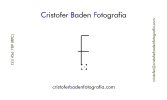
I'm a real estate/interiors/architecture photographer taking a stab at designing a logo for my new business to be used along with my name on my website and on a business card, as is posted below.
This is my third or fourth attempt; the others were weak. Tried to simplify as much as possible and used the design in this link as inspiration.
http://bpando.org/2013/02/08/logo-andrew-schweitzer-foto/
My wife suggested putting little icons you'd see inside the viewfinder of a camera in the corners or along the edges (battery strength, ISO, shutter speed, aperture, etc.) to suggest the view through a viewfinder, but I'm thinking it's probably not necessary and just might add a level of cheesiness.
Thanks for any constructive criticism you can provide.
