You are using an out of date browser. It may not display this or other websites correctly.
You should upgrade or use an alternative browser.
You should upgrade or use an alternative browser.
Looking for a background color for my Logo
- Thread starter CarlosMedina
- Start date


eddypeck
Member
Take a look here: https://mycolor.space/
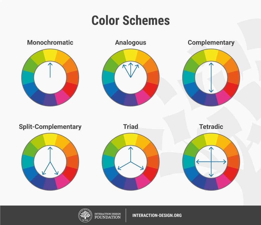
Enter a Hex or RGB value and it gives you suggestions for themes, based on complimentary or contrasting colours. Or go old school and look at a colour wheel:
Besides colour feedback, I'd question if the font size within the logo is too small in proportion?
When used at its smallest size would the name still be legible, or the flip side, to keep it legible would the logo always need to be seen big?
I don't know if breaking onto 2 lines would work for you, I feel like it wouldn't but could you break the text out of the surround. Or at least, I note the surround is thicker at the sides and thinner top and bottom could you change that?
CarlosMedina
New Member
fisicx
Active Member
I use this colour wheel thingy: https://paletton.com/
I like it because it includes colour blindness simulator (amongst many other tools).
I like it because it includes colour blindness simulator (amongst many other tools).
fisicx
Active Member
Looks like a coffee brandDo you have a good feeling, your first impression please.
P.S. : I know that background can play a role in the perception of colors.
Naheed
Member
Hello,
The color combination to me does not seem suitable. The background color must be changed so as to have some contrast. The logo color must be
visible by having a lighter background. If the logo’s for your own use, then it’s really your preference. If the logo’s for someone else, then the client
should be able to share their vision as to what they want.