You are using an out of date browser. It may not display this or other websites correctly.
You should upgrade or use an alternative browser.
You should upgrade or use an alternative browser.
Logos - how can I improve them
- Thread starter wbe
- Start date
FormeCreative
New Member
Only advice i can give is try and simplify them if you can. Make sure the text is legible and there is enough contrast between the text colour and the colour that the text is sitting on. Even try and take the text off the graphic. I always take a step back when designing a logo and think:Hi everyone,
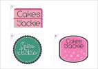
I've been working on 3 designs and need some advice at this point. Just need to know what works and what doesn't. Thanks!
- will it be legible when it is small
- is it likely to reproduce poorly in a newspaper ad (newspaper print at a lower dpi than regular offset print)
- are the colours adaptable between cmyk and rgb
What you should end up with is a logo that can be reproduced across a number of mediums at different sizes at not raise any appearance issues.
Hope this helps
Katedesign
Well-Known Member
Good advice above... KISS is always a good motto. And think about it being printed small - on a label or something like that!
I try and design in mono/black first of all, colour comes afterward. Definitely no drop shadows.
Fewer dots round the edge...if they are the silver balls that go on cupcakes I'd never fit that many on!
Space the lettering - but I think they all have merit!
I try and design in mono/black first of all, colour comes afterward. Definitely no drop shadows.
Fewer dots round the edge...if they are the silver balls that go on cupcakes I'd never fit that many on!
Space the lettering - but I think they all have merit!
milkminnie
New Member
I like the 2nd but id say lose the bevel.I like the way you have tried to make it quite kitch. I really like the 3rd one buy the type just doesn't feel right to me, feels like its been squashed in. For a first attempt though, well done man.
SparkCreative
Member
Are you working in Photoshop or Illustrator? I only ask because of that bevel you've used. Lose it, simplify as others have said. Also, these look kinda like I've seen them before. Cake makers don't always have to have a retro 50's style logo in candy pink. Look at the Hummingbird bakery, for instance.
