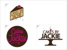
Logos - critique please

If I had to pick one, I'd say the slice is the nicest. Although I'm not keen on the straight typography. Perhaps hand-draw the text on the side of the cake like you did on the other design. You can get more creative with this. The company is a fun one, not a boring, corporate business.
 
I prefer the second option, but feel you were closer with the similar option to this one in your initial post.
 
Second or third (with some tweaks) for me, i don't like the first option.. it feels a bit.."clipart-ish" to me, but it only matters what your client thinks :) ask 100 people, get 100 different opinions, you can't please everyone, only the client matters!
 
For me, I like the second one but don't think my eyes can cope with the pink text on the brown background.

Would like to see it in a different colour though, think it looks modern and I love the typography.

All three are certainly big improvements on the originals, though!
 
Thanks for you reply, Tony. Can I ask what did you liked about the initial version of option 2?
 
Thanks, Boss. I must admit I spent very little time on the 3rd one. The cherry bugs me a bit. I think it might get lost on a small version of the logo. And maybe the text at the top can be a bit bolder.
 
Back
Top