Logo up for critique

Hi Guys,

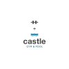
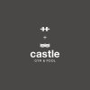
Attached are 2 screenshots of an initial design concept put together for critique.

Hopefully all becomes clear once viewed, if not its back to the drawing board.

All feedback appreciated...

 

Attachments

  • Screen Shot 2015-02-24 at 22.33.07.jpg
    Screen Shot 2015-02-24 at 22.33.07.jpg
    5.1 KB · Views: 52
  • Screen Shot 2015-02-24 at 22.32.40.jpg
    Screen Shot 2015-02-24 at 22.32.40.jpg
    5 KB · Views: 44
THT + water = castle gym pool

In other words, you could drop the top half and work on the bottom half.
 
Better quality attachements

Hopefully these are better to view than those previously...

Hank, is the equation above how you are reading the logo?
 

Attachments

  • 1.jpg
    1.jpg
    64.3 KB · Views: 27
  • 2.jpg
    2.jpg
    65 KB · Views: 33
Last edited:
Hi Clarke, I can see where you taking this logo mark, but not quite there yet.

Could you place a more accurate Castle roof?
Type in Google: "castle logo" or something suitable to get inspiration.

I would also replace the window 'cross', it looks medieval like and may be associated with religion.
 
I would focus primarily on the words 'Castle & Gym' to form strong mark for the logo. The pool part is a bit trickier, and a bit unnecessary imo. Think of the words 'Pool', 'Castle' and 'Gym' - 'Pool' just seems like the odd one out. Plus most reputable gyms nowadays come with a pool anyway, so it's not like its a USP.
 
Keep it black and white for now. A few points from me;

  • It has a very tall and awkward footprint
  • The plus symbol has flaired edges which makes it not look like part of an equation
  • Not a fan of the lowercase 'C' and use of Helvetica here as it lacks and feeling or style.
  • t's quite literal – GYM + POOL. For me, "Castle" should be the focus. It's a distinctive name for a gym/fitness centre.

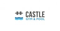
Can you drop the plus symbol and bring the other two elements together perhaps? I'm almost seeing the distinctive top of a castle turret in the 'weight' mark, and combining that with the water, you could form a 'moat'

Or can the weights look more like a castle with the water forming the moat? Then you have castle, gym AND pool covered
 
Paul, your the first one to pick up on the castle turret that is left behind with the Dumbbells , plus sign and the pool arranged in this way. Will revise chosen typeface. Plus/and sign also makes the window from which archers would defend the castle.
 
Taken on board your critique and attached is a revised concept, please let me know your thoughts...
 

Attachments

  • New Concept Post.jpg
    New Concept Post.jpg
    71.4 KB · Views: 26
Back
Top