Logo review

adamhook

New Member
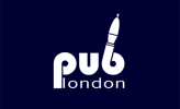
Hi. I'm designing a logo for a new web site that reviews pubs in london. The brief was left fairly open as they just wanted to see what I would come up with. Before I go back to them I would like to get some views off some of you pros out there if poss. Many thanks!

Adam
 

Attachments

  • publondon1.jpg
    publondon1.jpg
    10.7 KB · Views: 28
  • publondon2.png
    publondon2.png
    15 KB · Views: 27
hmm the one on the right with the pump is a good idea, however, get a few drinks down ya and it will soon start to become a phallic symbol lol

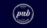
the one on the left better, a beer matt?

Beer Matt would be my way to go or a pint glass with some kind of thumb or tick (those are just ideas on instant recognition rather than the final idea), the logos you have though don't really say what it's about though, the problem you will face is for it to become recognisable as a review logo.

Is the website also wanting its logo putting into London pubs as a marketing/pr stunt too?
I would possibly have under the pub ("reviews") so your left with no doubt it's a place to review pubs, get in on the scene kind of thing
 
Thanks Kev!

Yeah my girlfriend saw the phallic symbol staright away and she hadn't been drinking. So prob best to steer clear.

The left one is a bottle top but could be a matt too I suppose. I see what you mean when you say it isn't instantly reconisable as a review site. I have tried converting the 'u' of pub to a tick but it wasn't really working for me. Perhaps I will give it another go.

Cheers

Adam
 
I do like the second, although I agree about how it could be interpreted. Although this could bring humour to the brand and maybe people would see it as less formal. So it depends on the audience really, it could be hit or miss.

In regards to the first design, to me it seems more in the style of a traditional pub, again, maybe need to get a good idea of the audience or the pubs that are being reviewed.

Maybe it would be best to have the mix of the two.

I would also definitely try and work away of prompting the company you are designing for you try and get beer mats etc. It would increase awareness a lot.

Hope this helps :)
 
Thanks for your thoughts its much appreciated!

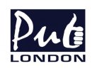
I tried using the 'U" as a tick but it wasn't quite working. I took your advice Kev and incorporated a thumb and I think it works quite well.

What do you think?

Cheers
 

Attachments

  • publondon3.jpg
    publondon3.jpg
    12.9 KB · Views: 11
Yea looks great Adam, nicely worked in, although I meant the tick/thumb as more of an idea than literal, however, it really lends itself well.
You can also see that by putting in the thumbs up it instantly gives the idea of if a pub is ok kind of thing.
Could also wrap the b and hand/thumb around a pint glass but probably going a bit ott.

How many are you showing to them? I would do 3 max.

Let us know which ones you put forward, what their thoughts were on each and the final one picked.
You could also do a case study from this too which would make for excellent material for site and potential customers.

If you come into loads of money or too much paid work from the ideas then I gladly accept donations or work ;) heheh
 
Last edited:
Thanks Kev. Still needs a little work but its defo on its way.

Yeah meeting the guy tonight, max I will show is 3 but might show less as I think this will work best. I'l let you know how it goes and yes I reckon we should split it all from now on 50:50 yeah?! :)

Thanks again Kev, you the man!
 
Back
Top