Aerodyll
New Member
Hi guys. After some advice I received on here I have recently started a new project that will enable me to practice logo design. I will be making a series of 26 logo's, one for each letter of the alphabet. For each logo I will begin by creating a creative brief like what I may receive from initial discussions with a client. This brief may be something I already have in mind but the idea is that I will use brief generator websites to give me a start so I do not spend too long creating the brief and can jump into the work. Note I will not be making a logo for the letter 'A,B,C e.t.c.' I will simply be using the letter 'A' as the first letter of the name of the fictional entity I will be developing my logo's for, a bit silly I know but gotta start somewhere and at least it gives me a frame to start with.
As the aim is to use this as a vehicle to accelerate my learning I will be using various Skillshare tutorials to learn new techniques and methods and incorporate these if they fit the brief. I will also be seeking feedback on my work, either by posting on here or maybe getting the help of some of my designer friends. So if anyone on here could oblige me with some comments I would be grateful. I am unsure whether it would be a good idea to show the brief or just give a summary of the entity as the briefs are a bit OTT to add here I think.
(I did intent to go in alphabetical order but my first brief sort of jumped out at me and got me enthused so they will not be in any particular order)
So below is project 001: Habitat
Habitat is a manufacturer and retailer of heavy duty camping supplies, think 'Go Outdoors' but for portaledges. They see their biggest competitors as 'Blacks' and 'Alpkit' and essentially want a logo that looks the part.
I have gone through a number of iterations, more detailed than this one but this is the final version that stood out to me.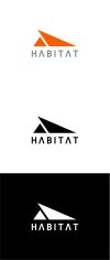
I have also toyed with the idea of a wider version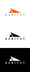
I discovered the shape with the triangles by accident while experimenting with shapes. I was drawing a tent to begin with but due to a pathfinder mistake I went down this route instead. The sharp angles are intended to look adventurous but not aggressive as the brand needs to look strong and reliable none of the angles could be so sharp as to look fragile. The small isosceles triangle is reminiscent of the basic shape of an old time tent but also as it is hanging under the overhand of the larger obtuse triangle it resembles the shape of a portaledge hanging from a mountainside. The negative space to the left of the two triangles implies a third triangle (I hope anyway) that makes the whole symbol look like an old style pitched tent or sleeping bag.
For colour I went with orange as this is a good high-vis colour used in a lot of safety equipment and would be a good colour to be associated with their brand of high end camping gear. The type is based on Consolas Bold, slightly edited on the A and I characters to make it a bit more sleek and recognisable.
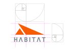
And for my amusement here is one showing a basic grid I made using the golden ratio. I honestly thought this was a bit of graphic design BS but when I overlaid the ratio over my work I was stunned. It actually really matches my original work which was a bit spooky to be honest. I will be using this from now on though.
So guys if you would oblige me please let me know what you think, I would be very grateful. Also let me know if I have waffled on too much. I wasn't sure whether it would be best to say less or more so I went somewhere in-between.
Thanks,
Ben
As the aim is to use this as a vehicle to accelerate my learning I will be using various Skillshare tutorials to learn new techniques and methods and incorporate these if they fit the brief. I will also be seeking feedback on my work, either by posting on here or maybe getting the help of some of my designer friends. So if anyone on here could oblige me with some comments I would be grateful. I am unsure whether it would be a good idea to show the brief or just give a summary of the entity as the briefs are a bit OTT to add here I think.
(I did intent to go in alphabetical order but my first brief sort of jumped out at me and got me enthused so they will not be in any particular order)
So below is project 001: Habitat
Habitat is a manufacturer and retailer of heavy duty camping supplies, think 'Go Outdoors' but for portaledges. They see their biggest competitors as 'Blacks' and 'Alpkit' and essentially want a logo that looks the part.
I have gone through a number of iterations, more detailed than this one but this is the final version that stood out to me.

I have also toyed with the idea of a wider version

I discovered the shape with the triangles by accident while experimenting with shapes. I was drawing a tent to begin with but due to a pathfinder mistake I went down this route instead. The sharp angles are intended to look adventurous but not aggressive as the brand needs to look strong and reliable none of the angles could be so sharp as to look fragile. The small isosceles triangle is reminiscent of the basic shape of an old time tent but also as it is hanging under the overhand of the larger obtuse triangle it resembles the shape of a portaledge hanging from a mountainside. The negative space to the left of the two triangles implies a third triangle (I hope anyway) that makes the whole symbol look like an old style pitched tent or sleeping bag.
For colour I went with orange as this is a good high-vis colour used in a lot of safety equipment and would be a good colour to be associated with their brand of high end camping gear. The type is based on Consolas Bold, slightly edited on the A and I characters to make it a bit more sleek and recognisable.
And for my amusement here is one showing a basic grid I made using the golden ratio. I honestly thought this was a bit of graphic design BS but when I overlaid the ratio over my work I was stunned. It actually really matches my original work which was a bit spooky to be honest. I will be using this from now on though.

So guys if you would oblige me please let me know what you think, I would be very grateful. Also let me know if I have waffled on too much. I wasn't sure whether it would be best to say less or more so I went somewhere in-between.
Thanks,
Ben
