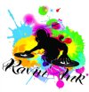
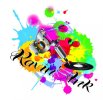
Firstly I apologise if i'm too new to ask this but having been searching the forums I have seen others asking and receiving great replies/help even though they are new which is refreshing to see :thumb:
I never normally have a design block but with the amount of pressure I'm under trying to get my tattoo studio done, produce music for the record label I'm signed to, sculpt/mould/cast and airbrush movie props and replicas and then DJ out and about.... And this is all while bringing up 2 babies practically on my own!!!!!!! When I come to sit down and try and come up with a design or even just idea's i over think it.... that or exhaustion is setting in!
I also think I want to cram too much into the logo to try and get the message across what it's about... which in my book is a big no no lol. Simple but effective is how i've always tried to design logos etc.
As I put in my introduction I have been doing web design and programming for over 10 years, this includes doing design work for t-shirts/banners/flyers etc but I do not class myself as professional at all more like better then ok :icon_biggrin:
I was wondering if anyone would be willing to perhaps inject some inspiration and ideas.
Here's a run down of info about what the logo/branding is for:
The logo is for the Tattoo Studio I'm opening in the next month or so. It's name is Ravin' Ink - I have the web address too but haven't yet uploaded a site (not much point without the branding sorted). Obviously the name is inspired by my djing/raving and of course tattooing etc.
I want it simple but effective... with bright solid colours and obviously will have to be vector.
I appreciate all those willing to suggest ideas.... etc most of the things I've come up with are just quick put together ideas and feel cramped and too detailed. If it was put on a business card probably look stupid. lol!
A nice simple logo and then text Ravin' Ink no doubt etc.
Thank you all in advance!


