Fruitbat
Member
Recently got hired to design a logo for a new business 'Bella Vista - remodelling & investments'
the name is quite long and can long awkward (im not a fan of a lot of text within a logo design but hey ho!)
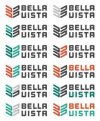
Anyways... this is the outcome i've got... clearly still torn with colour ways.

Anyways, the client isn't very keen on the typeface, eventhough its super close to what he wanted without me completely ripping it off. i've sent him other options but to me, this works better than any other option we've put out so far. The slight curves on the edges seem to work better with the icon itself....
any suggestions?
the name is quite long and can long awkward (im not a fan of a lot of text within a logo design but hey ho!)
Anyways... this is the outcome i've got... clearly still torn with colour ways.

Anyways, the client isn't very keen on the typeface, eventhough its super close to what he wanted without me completely ripping it off. i've sent him other options but to me, this works better than any other option we've put out so far. The slight curves on the edges seem to work better with the icon itself....
any suggestions?