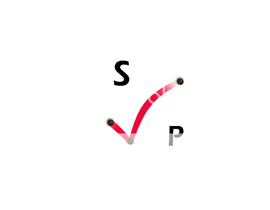
Sorry, but I'm not really a fan of either to be honest.
I can see what you're trying to do with the balls and the connection to squash, but neither of them say squash to me. I think you need to get back to basics (i.e. remove the gradients and effects etc, just get down to plain shapes, letters) and start over from scratch.
Consider what image the business is trying to project and have a look around for some inspiration; research logos of similar businesses to see what sort of styles are generally there. Obviously you can't just rip off the one you like the most but do have a think and see if it leads you anywhere.


