Rhonda
Senior Member
Does anyone have suggestions to improve on this design?
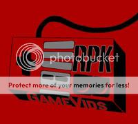
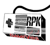
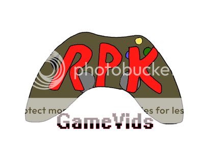
I know its rare that I have anything for critique and the last thing had alot of room for improvement. This one will too I'm sure, but I wanted to make a neat logo for a friend's YouTube page. Basically he does video reviews for retro and new console games. Anything from Atari to Sega. I have an initial idea which I've done in photoshop that I will share here. I'd like to make this a surprise for him but I'm not really pleased with what I have so far. Kind of emberrased in fact
It is supposed to be a game control pad with his YouTube name on it. Thing is I'm not too good at technical drawing. If it were some kind of animal it'd be tons better. That font is hand drawn which I am thinking needs to be realigned, and the actual control pad could be better. Like what could I do to the control pad to snazz it up, without having to resort to gloss. I also have an idea for an older model, but not sure which would be better. Thank you everyone.