Logo Feedback Animaction

Athos

Active Member
Hi everybody,

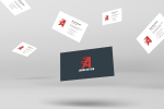
my first steps on this forum...So my name is Patrice, 27 years old & I'm from Quebec. Autodidact, I'm here to obtain some feedbacks around my last work, a logo for a small company named Anim'Action.

Anim'Action is a small entertainment company offering different kind of activities like Bubble Football, Archery tag, Snookball and others. The idea around the concept was to build something strong around the "A", the first letter of Anim & Action.

Let me know what you think about it ;)

ps : Sorry about my english, I need more practice :p
 

Attachments

  • cartanim.png
    cartanim.png
    519.3 KB · Views: 56
I'm not a big fan of the font that you've used to supplement the A logo mark. The multiple A characters in the wording itself all having the same slant/feel as the mark detracts from it. I'd be looking at a different font entirely for that text.
 
The multiple A characters in the wording itself all having the same slant/feel

It looks important for me, to show the connexion between them. That's why I choose to work on the A for anim and action using this way and for the same reason i'm not gonna change it but thanks for your feedback, really!
 
Sure, no problem. Is this a personal project or something for a client?

Either way, it'd be great to see it without the slanted A? Wouldn't take two seconds to try :)
 
Looks like you have a bit of a kerning issue with 'Ac tion'.
I'd like to hear about how you came about your concept, in relation to what the company actually does.
Also, the lines and dots coming out of the 'A' reminds me of morse code. What is it meant to convey?
 
Looks like you have a bit of a kerning issue with 'Ac tion'.

I'm gonna check this. Usually I work with guides, but now....when i'm looking to the logo......erf maybe you're righto_O

I'd like to hear about how you came about your concept, in relation to what the company actually does.
Also, the lines and dots coming out of the 'A' reminds me of morse code. What is it meant to convey?

First, Anim'action is my company (actually Le bubble Football BSL, but we're going to offer some new services soon so we need a more global name for the company..)

Now just to give you an idea around the concept : For me Anim & Action is related to movement! So that's why first I worked on a slanted A. The dot and lines arer simply here to reinforce this idea of movement. This is my starting point.
 
Very, very nice. I am impressed! What software did you create this in? Did you make the J & P yourself or did you edit it from a font?

The P looks better with the stairs correctly aligned with the door, you've gone back to the offset stairs in that latest attachment.

Also, you must always remember to check your kerning... look at your J & E for example in JEAN.
 
Back
Top