You are using an out of date browser. It may not display this or other websites correctly.
You should upgrade or use an alternative browser.
You should upgrade or use an alternative browser.
Logo designs - Feedback appreciated
- Thread starter ange p klaesson
- Start date
Tim Pennington
Member
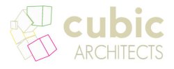
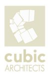
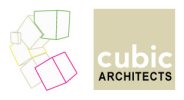
I like #1 and #2, but I'd prefer to see the 3d-ness at a different angle. it doesn't quite feel right IMO.
Also, the "cubic" and "architects" are in different fonts, which IMO don't really suit each other. I'd at least think about making sure they align up together.
Tim
Also, the "cubic" and "architects" are in different fonts, which IMO don't really suit each other. I'd at least think about making sure they align up together.
Tim
ange p klaesson
New Member
Thanks for your comments.
I shall try and see if I can improve it by using the same font and make it more 3d. I'll keep you posted.
Many thanks for your help,
Ange
I shall try and see if I can improve it by using the same font and make it more 3d. I'll keep you posted.
Many thanks for your help,
Ange
LovesPrint
Member
I think the lines in your mark/picture/graphic are too fine and detailed - it won't work at small sizes. It is a nice start though, the mark just needs simplifying, refining and the weight of the stroke increasing a bit, plus the attention to kerning and leading the others here have mentioned. I like the colour you've used. :icon_smile:
dot design
Member
Hi Ang
Thanks for sharing your work with us, very brave to put your self out there.
My comments would be that its abit over complicated and that maybe a simplier approach is needed, not sure the concept is working, that said I'm really just talking about the shape your trying to create with the box as the rest of it is looking good and I like the pale cream colour of the typography


