You are using an out of date browser. It may not display this or other websites correctly.
You should upgrade or use an alternative browser.
You should upgrade or use an alternative browser.
logo design
- Thread starter mick_mccabe
- Start date


graphicscove
Member
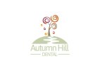
Something that stands out to me is the swirls on the tree. The brown one on the right is 'around' the branch coming from the tree not touching it while the other two go over the branch coming out of the tree. I think the break in the swirl for the branch looks better and should be consistent over all 3 swirls.
balders
Member
I disagree. Tress aren't consistent, sometimes its OK not to be consistent. Putting a break in the other 2 would look odd because break would be in a thick part of the swirl, unlike the swirl with the broken section now. If you make the swirl thinner so you can break it up what are you really gaining? Each to their own.
Levi
Ultimate Member
ok...like the idea but would tweak it a little
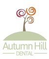
If it was me I'd remove the 4 random swirls floating in the air and try it without the white swiggle down the hill.
I'd also adjust the width of the hill and line to match the overall width of the text so it's like a box so to speak. It just looks off as it stands now. Same with the Autumn Hill text, I'd just move that down just a tad.
I've attached a quick mockup as it's probably easier to show it, it's a bit rough on the hill curve but it gets the idea acroos")
If it was me I'd remove the 4 random swirls floating in the air and try it without the white swiggle down the hill.
I'd also adjust the width of the hill and line to match the overall width of the text so it's like a box so to speak. It just looks off as it stands now. Same with the Autumn Hill text, I'd just move that down just a tad.
I've attached a quick mockup as it's probably easier to show it, it's a bit rough on the hill curve but it gets the idea acroos
Attachments
mick_mccabe
Member
S
Squiddy
Guest
I really like this logo! There are definitely a few issues with it for me though.
Firstly, the text is lost with the strong contrast between the pale green and the strong, vibrant colours of the tree.
I agree with graphicscove that the tree would look better if the two uppermost swirls were the same as the bottom right one. It's not about consistency for me, it just looks better with the swirls going round the branches than through them.
I'm not too sure on the font you've chosen either, apologies for not being more specific, it just doesn't seem to match the design, in my opinion.
I'm undecided on the path, perhaps you could try the hill as just a thick semi circle outline instead of applying a fill colour to it?
If you're going to have the extra swirls around the tree, can I suggest reducing their prominence in some way, try reducing their opacity to around 40%.
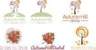
As for the other logos, the leaf ones look like clipart, the top right one looks a bit too fruity for a dentist. The bottom right one looks pretty good, again, I'd reduce the prominence of the swirls on the ground. I like the font, but I'm wondering how well it fits the clients brief? As I said, the font looks good but it doesn't scream dentist to me.
Good luck with this promising logo!
Firstly, the text is lost with the strong contrast between the pale green and the strong, vibrant colours of the tree.
I agree with graphicscove that the tree would look better if the two uppermost swirls were the same as the bottom right one. It's not about consistency for me, it just looks better with the swirls going round the branches than through them.
I'm not too sure on the font you've chosen either, apologies for not being more specific, it just doesn't seem to match the design, in my opinion.
I'm undecided on the path, perhaps you could try the hill as just a thick semi circle outline instead of applying a fill colour to it?
If you're going to have the extra swirls around the tree, can I suggest reducing their prominence in some way, try reducing their opacity to around 40%.
As for the other logos, the leaf ones look like clipart, the top right one looks a bit too fruity for a dentist. The bottom right one looks pretty good, again, I'd reduce the prominence of the swirls on the ground. I like the font, but I'm wondering how well it fits the clients brief? As I said, the font looks good but it doesn't scream dentist to me.
Good luck with this promising logo!
mick_mccabe
Member
Squiddy cheers for the input, looking at it ur right about the text being lost abit. I'll hav a go at rearranging some things around and playing with some colour changes perhaps. I don't get much working in a printers i dont get muchh creative work coming my way, I want to take this into branding letterhead conp slips etc. something that hopefully wld look good in my portfolio.
S
Squiddy
Guest
Make a couple of revisions and I think this would look great in anyone's portfolio