Logo Design - PLEASE HELP

jessicajenkins

New Member
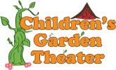
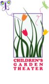
I have created a logo for a childrens theater - the client has requested a possible beanstalk through the lettering and the house from the three little pigs. I have created one to client's request and one other...

Please let me know what you think...thanks!!
 

Attachments

  • garden logo2.jpg
    garden logo2.jpg
    44.2 KB · Views: 35
  • logo1.jpg
    logo1.jpg
    60.5 KB · Views: 23
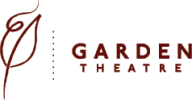
I definitely prefer the one on the left, although it doesn't really scream theatre, to me, more nursery.

The left is more professional, the right more the run of the mill Childrens style, which may well be what she's looking for.

Not sure what else to add, I'll leave it to the others :icon_smile:
 
I'd leave those if they cover the options he wanted but then throw something more simple. I've attached a garden theatre logo I found below. I like it because its simple and represents the theatre through its elegance and the obvious simple shape of a leaf. I'd say the key is to simplify it.
 

Attachments

  • Logo.png
    Logo.png
    2.1 KB · Views: 13
Last edited:
^^^ What he said for sure :) Be careful of your details - thin lines and wispy bits will disappear at small sizes. Think 'it must be clear when reduced to business card size.' Reduce your colour palette.
 
Are you based in America? Sorry just thought the spelling of Theatre you have is the American spelling. In the UK its 'theatre'. Just checking.
 
Are you based in America? Sorry just thought the spelling of Theatre you have is the American spelling. In the UK its 'theatre'. Just checking.

Yes, Jessicas based in Savannah so the spelling is correct :icon_smile:

I too agree with what Andy said.
 
Thanks everyone for the feedback! Yes, I am based in the US and that is the spelling he used (thanks though)

I will def. consider everyone's feedback and post some revisions soon! Thank you so much!

-Jessica
 
revisions

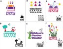
Okay....I've worked on the logo a bit

• reduced color palette and details to the original "beanstalk" logo

• added stars to the the logo with the grass to give it a little theater feel to it

• added a few others...please let me know what you think :icon_biggrin:
 

Attachments

  • logos.jpg
    logos.jpg
    60.4 KB · Views: 25
sorry to overwhelm

sorry to overwhelm you with all of these options, but this project is due Monday and I am trying to get as much feedback as possible.

I have come up with one more option for the original request of the client (the beanstalk and 3 little pigs house) It's another take on the option "D" on my last post

thank you, thank you!! :icon_notworthy:
 

Attachments

  • houseandbeanstalk.jpg
    houseandbeanstalk.jpg
    13.4 KB · Views: 8
The content is fine. It's too high for me though, I would make the house smaller height wise and drop the beanstalk down in size too, so it's more of a square shape overall.

As it is it's not the most usable, with the changes to size though you could meet the clients needs well :).
 
Hi jessica, I know you haven't got alot of time, but if you get chance, just type out the text and have a look at the letterforms, there maybe some subtle ways of working the plants etc into one or two of the letterforms rather than fully illustrating as you have been.
 
Thanks Everyone!

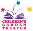
Thanks everyone for all of the great feedback. The client has chosen a logo which I have attached below...thanks again!
 

Attachments

  • 72dpi.jpg
    72dpi.jpg
    19.5 KB · Views: 5
A and B are very retro late 70's early 80's... has to be C as this looks great single colour, and in colour, is a lovely compact design with good composition, plus it also promotes reading and looks fun / magical.
 
Back
Top