You are using an out of date browser. It may not display this or other websites correctly.
You should upgrade or use an alternative browser.
You should upgrade or use an alternative browser.
Logo Design Opinions Please
- Thread starter kberry21
- Start date
Sam Cowley
Member
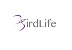
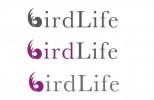
I like the colours used, but I first read it as "irdLife". After a couple of seconds I noticed that there was a B, but I shouldn't have to look for a couple of seconds to notice it. I think an easy change would be to angle it more vertically so it resembles a B more. If you could give us some information on what the background of the company or person is wanting for this logo then we maybe able to help you more. I like the way you're going with this design so keep us updated on the changes you make! 
Hi Sam,
the logo is for a company called Bird Life. They have requested the B be a bird and prefer an eagle. I have managed to sculpt it so it resembles an eagle and it is slightly b shaped. However i think your right its not dead obvious its a B. I will try changing the angle on it and see if its more legible?
the logo is for a company called Bird Life. They have requested the B be a bird and prefer an eagle. I have managed to sculpt it so it resembles an eagle and it is slightly b shaped. However i think your right its not dead obvious its a B. I will try changing the angle on it and see if its more legible?
@GCarlD
Well-Known Member
The simplest solution would be to actually add a 'B' to it. You are in a difficult situation with the design as it stands it looks like a bird / eagle but it is not so obvious as a 'B,' and I feel the more you try to make it look like a 'B' the less it will look like an eagle. The same with the angle, as it stands the angle it perfect for an eagle soaring through the sky, while if you angle it to look more like the letter 'B' it will take away from that kind of 'in flight emotive.' Actually adding a letter 'B' solves this as the eagle works well as a 'mark' to accompany the text. Another reason why it may be less legible as a 'B' in its current form is that it is a different colour and weight from the text. I'm not saying it should all be the same colour & weight but that does detach it a bit if you like.
I would also consider possibly using a different font and please fix the kerning!
I would also consider possibly using a different font and please fix the kerning!
Last edited:
Paul Murray
Ultimate Member
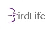
That's a much closer resemblance than what you had previously, which was the main gripe for me. I'd recommend creating the logo in a single colour (black) until the two elements come together, then you can start switching colours but only IF it works and is needed. Having the B/Bird in a different colour automatically creates separation so use colour carefully. Another option is drawing the bird and the lettering to keep the line-work and styles consistent.
Paul makes a good point about the disconnect created through use of colour. I'd consider having the 'ird' text in the same colour as the bird device and 'Life' in another as this might tie the image and the related letters together better. All that said, I'm unconvinced by the image in its current form as it isn't self-evidently enough of a letter B: the logo makes a kind of sense when you put all of the pieces together but this requires a certain amount of effort - minimal, but significant.
@GCarlD
Well-Known Member
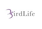
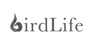
That looks much better as a 'b' but the kerning still hasn't been corrected, the letters have just been spaced out a bit that's all. Look at the 'r' and the 'd' for example. Another thing is, it looks a bit odd having a lower case 'b' for bird and then a uppercase 'L' for life.
Not sure about that serif font. When you are deciding on a font, you need to choose one that relates to the design in question. They should almost look related, quite literally, like they are siblings.
For example, have a look at this:
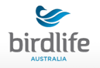
Can you see that font almost looks like its about to evolve into a bird?
lol please excuse my crazy analogies, I hope you understand what I'm trying to get across.
Not sure about that serif font. When you are deciding on a font, you need to choose one that relates to the design in question. They should almost look related, quite literally, like they are siblings.
For example, have a look at this:

Can you see that font almost looks like its about to evolve into a bird?
lol please excuse my crazy analogies, I hope you understand what I'm trying to get across.
That looks much better as a 'b' but the kerning still hasn't been corrected, the letters have just been spaced out a bit that's all. Look at the 'r' and the 'd' for example. Another thing is, it looks a bit odd having a lower case 'b' for bird and then a uppercase 'L' for life.
On the point of that uppercase 'L', not only does it not sit very comfortably with the lowercase starting point for the 'b' device but it's fatter than the other characters which further adds to the jarring effect. I'd also like to see the elliptical element of the 'b' thing more closely resembling the outer shape of the 'b' in whichever font you finally go with. If, however, I were starting this one from scratch, I think I'd play around with a blocked-out capital B shape, retain the shape on the right-hand side of the character and think in terms of creating my bird shape in negative space on the left-hand side (probably loosely following the internal shape of the B). That's probably as clear as mud though...
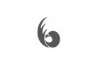
Ok, i have removed the captial L and it does look much better. Kerning has been adjusted and set - please point out any errors if you think i have some. I have also tried some different fonts i think the last design works well as the shaping is similar to the B? Thanks for comments - i really appreciate the 2nd eye on my work
 Thanks for comments - i really appreciate the 2nd eye on my work
 I think it looks more like a 6 now than "b".
