Logo design opinion

danbyi87

New Member
Hi,

I have recently completed this logo for a company. I was just wondering if I could get some feedback on what fellow designers think of the design. It was for a importers and wholesaler company called clearance king. The client wanted to stay away from all the arrows and worlds that other logos have.

Let me know what you guys and gals think.
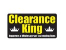
final design.jpg
 
My thought process when thinking of a logo concept is "what will it look like on a business card"?

What i mean by that is what will it look like when shrunk down? Can you read the text? Can you clearly identify the brand?

If I were you, i'd focus more on the "Clearance King" than the strapline. Maybe use the crown but incorporate the CK into it somehow?

Keep it simple and punchy - show off your creative side more! The last thing you want is your client to think he/she could've done a better job themselves.
 
What build is the black?
Why yellow text?
Do you have clearance for use of the crown?
Why is it in twice?
Why round the corners?

Why when I search for this that the logo is already in use in youtube videos? Was it already approved for?

Why are you wasting our time with this?

Go study logo design - what you have done here is not a logo.

I mean that in the nicest possible way. You need options, you need to work in B/W only, you need a good understanding of logo design.
 
Back
Top