Logo design feedback

Benchelt

New Member
Hi everyone,

I have been working on a logo for a while now & I wanted to get some valued feedback from the designers on here.
I was looking for a 1 colour, old fashioned style, logo for a mobile catering business.
I have spent far too long looking at it & I want to see what others think or any recommendations.
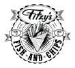
fitzys13_web.png
Thanks in advance,

Ben
 
Honestly...
Scale it down and look at it again, it loses a lot of detail
The 'ribbons' looks like fish tails, is that intentional?
Is the 'donut' supposed to be like a boat life saver ring because that's the vibe it's giving off to me.
The chips kind of look like stylised sky scrapers and it's hard to make out the fish (try turning it round so it's head out) against the chips, there's not enough 'white space' imo.

You say it's for a mobile catering business yet it's designed for fish and chips, is that all they sell?


Thanks for your input,

I will have to lose some detail as, Yes, when scaled down, it does not work as well as a smaller logo for a website.
Yes, the ribbons are supposed to look like fish tails & no the 'life saver' ring was not intentional.
I agree there could be more white space to lift the middle artwork & I will look at the fish & chip detail in the center.

Cheers,

Ben
 
It's nearly there, just need to simplify like Levi says.

You only need half as many hatch lines on the fish tails, and make them thicker. Lose the hatch lines on the
fries and have just one line in the middle of each to the pointed bit. The fish is a different scale to the rest, and I would
lose the newsprint, it will disappear when small - do they even use that any more?

Fitzy's needs a bit of work, that drop shadow is far too close. Quality produce etc is too small.
 
Many thanks Wardy.

I agree with all your points & it's great to get such great feedback.
I'm gonna go back & look at developing 'Fitzy's' a bit more & look at simpler versions of the logo for web.
The chips do look a bit art deco & I need to sort the fish out.

Nice one
 
Back
Top