Squevasquidge
Member
Hi Folks,
I'm just at the early stages of developing a logo for a one woman run hand made card business. Her cards are exquisite, pure luxury. They are made with such flair and class, they don't come across as the kitch, rustic handmade cards one would usually see. She wants a logo that portrays luxury, skill and the fact that they are handmade. Her products speak for them selves (she has lush photography of them too which helps) and I felt that something simple would compliment them best and I wanted at all costs to stay away from the hand drawn (which seems to be rife within the industry).
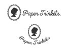
I'm really struggling with doing class, sleek, luxury with a handmade element to it. The images below are the first few ideas I have moved to the computer. I haven't sorted alot of elements, kerning and refining (esp when it comes to the fan and box!)etc. But I would really appreciate some thoughts on what the ideas convey to you/could convey to the public. Really, if you feel Im going in the right direction? Any thoughts or words of wisdom or inspiration would be great!


The box version is probably the most well rounded in my mind, the others need ALOT of work and if worth taking there I will seriously refine and add detail.
Thanks,
I'm just at the early stages of developing a logo for a one woman run hand made card business. Her cards are exquisite, pure luxury. They are made with such flair and class, they don't come across as the kitch, rustic handmade cards one would usually see. She wants a logo that portrays luxury, skill and the fact that they are handmade. Her products speak for them selves (she has lush photography of them too which helps) and I felt that something simple would compliment them best and I wanted at all costs to stay away from the hand drawn (which seems to be rife within the industry).
I'm really struggling with doing class, sleek, luxury with a handmade element to it. The images below are the first few ideas I have moved to the computer. I haven't sorted alot of elements, kerning and refining (esp when it comes to the fan and box!)etc. But I would really appreciate some thoughts on what the ideas convey to you/could convey to the public. Really, if you feel Im going in the right direction? Any thoughts or words of wisdom or inspiration would be great!


The box version is probably the most well rounded in my mind, the others need ALOT of work and if worth taking there I will seriously refine and add detail.
Thanks,