Logo Critique

Evening All,

Just wanted your opinions on these logos I designed:

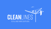
Clean Lines: Fabric supplier.
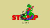
Stomp Sound: Sound system and speaker hire.
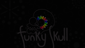
Funky Skull: Soul bar and lounge.

Any improvements and suggestions welcome!

I'll be doing mockups once they're final; I just don't want to go to the trouble of making them if there are ways I can improve the initial design first.

Thank you.
 

Attachments

  • Clean Lines Business Card-01.png
    Clean Lines Business Card-01.png
    28.6 KB · Views: 19
  • Stomp Sound Business Card-01.png
    Stomp Sound Business Card-01.png
    81.3 KB · Views: 19
  • Funky Skull Business Card-01.png
    Funky Skull Business Card-01.png
    98.6 KB · Views: 18
Clean lines - too many details
Stomp - too many details
Funky Skull - good - glows lost in print - how would it work on a light background?
 
They're not really logos, they are illustrations put with some text. You need to simplify and refine them, then do it again.
Stomp is far too detailed (and the text almost illegible), and I'm afraid your illustration skills are not suited to something like that, which
is another reason you need to simplify them. Remember - K.I.S.S! The back-up text is a bit too small too.

I suggest you need to do a bit of research and check out how other logos are designed. Do lots of thumbnail sketches first, specially with the Stomp one -
try and get that same information in to a sketch 2-3 inches in size, even if it means ending up with just a record and a foot, for instance.
 
Clean lines - too many details
Stomp - too many details
Funky Skull - good - glows lost in print - how would it work on a light background?

Thank you, will revise them!
I wouldn't put them on a light background, the whole brand of it would always be a dark background. (Signs, flyers, beermats, menus) but I will have a look to see how it could work. :)
 
They're not really logos, they are illustrations put with some text. You need to simplify and refine them, then do it again.
Stomp is far too detailed (and the text almost illegible), and I'm afraid your illustration skills are not suited to something like that, which
is another reason you need to simplify them. Remember - K.I.S.S! The back-up text is a bit too small too.

I suggest you need to do a bit of research and check out how other logos are designed. Do lots of thumbnail sketches first, specially with the Stomp one -
try and get that same information in to a sketch 2-3 inches in size, even if it means ending up with just a record and a foot, for instance.

I knew I'd over complicated them, I always end up blurring the lines between logo and illustration. I get too carried away.

I like the idea of just using the foot and record for the Stomp logo.

Thanks!
 
Thank you, will revise them!
I wouldn't put them on a light background, the whole brand of it would always be a dark background. :)

There are some substrates that won't allow a background - I recently did some bookmarks that are used for planting seeds - and you couldn't have a solid ink background.
 
I am afraid they don’t work on a number of levels.

Firstly the kerning needs attention on them all. In addition, scale them all down to the size of a business card and many parts would be illegible, especially if you consider w/o of a solid background. Some of the fine lines are just going to fill in.

The other thing they all have in common is serious mixed messages problems.

Clean Lines; looks more like a logo for a domestic laundry service, than it does a fabric supplier.

STP sound (this is how it reads); looks partly as though it is for children in execution, but the subject matter doesn’t.

Funky Kull (ditto); for me, this is the worst of the lot. Even if it is supposed to always be on black (though I dispute the fact you will never need a black-on version), it is pretty illegible, especially if it is in a club with changing light. You shouldn’t have to work that had to see what it is. I only know because you told me. I assume it is meant to be fun and light. It doesn't come across this way. To me it just seems unharmonious and doesn’t say Soul Music.

They just look like no real care has been taken and they have be thrown together. There is a reason good logos take a long time to produce well – much of that before ‘pencil’ even touches paper/tablet.

I suggest doing some more research. Are they fictitious logos, or actual jobs? If the latter, you need to have more conversations with your clients to determine the focus of their business. These are just abstract representations, not visual mnemonics.
Thanks for the advice.

They're fictitious and these are only the first drafts. They're not complete by a long shot. I just needed to know what direction to go in next.
They're already business card size, they're roughly 2inch by 3.5inch
 
Back
Top