You are using an out of date browser. It may not display this or other websites correctly.
You should upgrade or use an alternative browser.
You should upgrade or use an alternative browser.
logo crit
- Thread starter rachaelbethany
- Start date


Green Sheep Design
Member
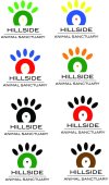
I'm not too keen, it's not very obvious what the shape is meant to be? What is the triangle in the middle representing?
Neautral tones spring to mind when thinking of an animal charity, greens, browns, creams - not as vivid as the ones you have chosen. Put a colour pallete together and have a play around to see which compliment each other. If you're really stuck on colours you could alway find inspirartion from here: Color Trends + Palettes :: COLOURlovers
Neautral tones spring to mind when thinking of an animal charity, greens, browns, creams - not as vivid as the ones you have chosen. Put a colour pallete together and have a play around to see which compliment each other. If you're really stuck on colours you could alway find inspirartion from here: Color Trends + Palettes :: COLOURlovers
Katedesign
Well-Known Member
As a cross between a paw-print and a turkey or cockerel you need to make it look a bit more like one or the other. Animals do suggest earthy colours or greens - but it also needs to work in one colour (black). It is a good idea to try a few colour palettes - complementary and contrasting and give the client a choice.
LovesPrint
Member
Your concept immediately made me think:
if you made the paw centre (and the pads too) look more paw shaped - it's a little round at the mo, and give it a cut out as if it's (the sun) rising over a hill, lose the centre triangle, and get your mark made in black only until its right then think of colour.
if you made the paw centre (and the pads too) look more paw shaped - it's a little round at the mo, and give it a cut out as if it's (the sun) rising over a hill, lose the centre triangle, and get your mark made in black only until its right then think of colour.
MJPGraphic
New Member
I think the paw should only have 4 pads, 5 looks too many, maybe even 3. I can't remeber seeing an animal with 5 pads in a print. Not to repeat what has already been said but what does the triangle represent? I'd maybe think about the name of the sanctuary, the range of animals they care for (assuming its not just dogs or cats as the logo suggests) and incorperate those factors. I'd also agree that the colours are too vivid. Hope thats helpful!