Logo Crit Please. Thanks

Esh

Member
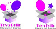
Hi, Just wondering if I could have you honest thoughts on this logo I'm doing for someone? Basically its a childrens party planner (girly pamper parties mainly) and basically she wanted balloons coming out of a box! My hardest thing was the font/type I would would say...Didn't do anything to it, just used a simple font to make it bold but childish/friendly-ish/cutish if that makes any sense?

Any constructive critism welcome. Thanks

Toya Belle Logo.jpg
 
Nothing wrong with the concept (party as a product/balloons in a box) and the colour scheme obviously fits the brief. The font's okay too although I'm hot keen on the 'y' and I'd probably limit it to the trading name and go with something a bit more formal and understated for the service description. As for the illustration, it looks a bit busy/imbalanced to me (four balloons is at least one [and perhaps as many as three] too many and, being the same size, they look a bit flat). In short, I feel that you could communicate everything here with far fewer repeated elements, perhaps to the extent that it could be reduced to a single balloon with a single star on it coming out of a box.
 
Thanks guys I'll keep playing around with it. It would be okay as an illustration but is too busy for a logo and "you should know that" so I'm told! Its only the first attempt though and only took me about an hour so I won't be too hard on myself yet :icon_tongue_smilie:

Cheers I'll update later :icon_cheers:
 
Last edited:
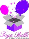
Had another quick go before I go to work....Tried to simplify a little bit...not sure it's working though. Its the font thats killing me the most! :icon_hide:

Toya Belle Logo 2.jpg
 
As everyones said before me, i like the concept and i do like the 2 balloons with the little stars aswell.

The font reminds me of a 50s? french cafe, i don't know why lol.

The one thing i really dislike (sorry) is the gradient on the box, i don't think it needs to be there, maybe just have it 1 colour on each side like a light pink and dark pink.

Hope that helps :)
 
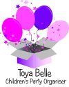
Another font...:icon_dunno: lol

Toya Belle Logo 3.jpg

I've done a quick search on girly/princessy type parties and organisers, and a lot seem to use those comic sansy type fonts or italic/fancy font...i've tried one which is slightly more girly.... :icon_hide:
 
I think it needs to still be stripped back much more, do you even need the box?

Yep. Same for the stars and balloons. She likes it as it is now. In fact, she preferred the one with the 4 balloons but the font I used on the last one. :icon_Wall:
 
Just one other (late in the day) thing: that caligraphic/scripty font with the continuation stroke looks a wee bit clumsy with an outline applied as the point at which the letters join has an edge rather than a proper connection (I think it would generally be more effective if you closed up all the gaps for the proper joined-up writing effect).
 
It looks a bit cliparty. As other have said, it's way too complicated - too many grads and elements. I'd strip it right back. A good tip - design logos in pure black to begin with then you won't get bogged down with grads and colour and you can keep things simple.
 
Thanks for the tips i've taken them on board. I can't really go much further on the design as the lady knew what she wanted from the start and thats that! I'll refine it and do a couple other versions or heavily tweek that one for my own purposes...Well, I need to deffo work on my typo skills and work out some sort of process to follow with all projects - any tips welcome :icon_sneaky: - Ah well I guess I have to start from somewhere :icon_biggrin:.
 
It's always the way it goes. The most stressful thing about design is possibly working with clients who don't understand it.

I'm working on a 4 page menu, which the client just asked me to try and include another pages worth of food onto. I replied "It's a sheet of paper, not the tardis"

Keep it up though, best to grin and bare it :)
 
just remember who you are designing for.... not yourself and not for us...

as long as it's what your client wants, then you have fulfilled your brief! :icon_smile:
 
Back
Top