You are using an out of date browser. It may not display this or other websites correctly.
You should upgrade or use an alternative browser.
You should upgrade or use an alternative browser.
Logo: Challenging, abstract design goal!
- Thread starter Reverend Speed
- Start date
Reverend Speed
New Member
Reverend Speed
New Member
Reverend Speed
New Member
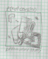
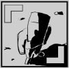
@hankscorpio - Roger, understood. On the gritty small details front, I think I can probably get rid of the literal grit and stones (which I had to emphasize the lighting), but I'm still trying to work out what to do with the upper left viewfinder. The bottom right I could use the negative space of the shadow, but the upper left is sorta resistant to being part of the 'whole'. I guess I can have the character lift their arm up to have the ul viewfinder cut out from it. Maybe they're holding up an object...? =/
Not sure I want to complicate this MORE, but I do want to pull the viewfinders into the overall shape of the logo.
On clean lines, I hear you. I'm not sure I'm there yet - or rather, I'm not a good enough artist to deliver clean lines on every iteration (see my leaning on 3D software). We'll get there!
Great point at the small logo sizes. I'm not sure we're going to get to the Swoosh, though - we may end up somewhere around Starbucks, if we're very lucky. None of those logos are dependant on perspective either... Ehh, not whining, thinking out loud (in text). =)
@Wardy - I think you're being a little too kind with the 'drawing ability', but I'll continue to iterate on paper when I get a chance. Honestly, once I pulled the heart out, I was so pleased with the immediate result, I just wanted to throw up a version for y'all. =P And it makes sense too... As you say, I was being too literal with the heart - just the fact that we're bothering to capture the 'look' of fixed cam games says 'appreciation'.
I'm tempted to remove the viewfinders too, but I think that'd shift the 'intent focus' from the act of viewing to just inspecting the figure. Either way, getting rid of the heart was a fantastic call, thanks!
A very fast (and instantly regrettable) experiment with hiding the text in letterboxing...

Oy. =(
I think the text will have to go top and bottom of the square, maybe even a word wrapped to each side or something. Anyhow.
Thanks for the feedback, folks, extremely useful!
Not sure I want to complicate this MORE, but I do want to pull the viewfinders into the overall shape of the logo.
On clean lines, I hear you. I'm not sure I'm there yet - or rather, I'm not a good enough artist to deliver clean lines on every iteration (see my leaning on 3D software). We'll get there!
Great point at the small logo sizes. I'm not sure we're going to get to the Swoosh, though - we may end up somewhere around Starbucks, if we're very lucky. None of those logos are dependant on perspective either... Ehh, not whining, thinking out loud (in text). =)
@Wardy - I think you're being a little too kind with the 'drawing ability', but I'll continue to iterate on paper when I get a chance. Honestly, once I pulled the heart out, I was so pleased with the immediate result, I just wanted to throw up a version for y'all. =P And it makes sense too... As you say, I was being too literal with the heart - just the fact that we're bothering to capture the 'look' of fixed cam games says 'appreciation'.
I'm tempted to remove the viewfinders too, but I think that'd shift the 'intent focus' from the act of viewing to just inspecting the figure. Either way, getting rid of the heart was a fantastic call, thanks!
A very fast (and instantly regrettable) experiment with hiding the text in letterboxing...

Oy. =(
I think the text will have to go top and bottom of the square, maybe even a word wrapped to each side or something. Anyhow.
Thanks for the feedback, folks, extremely useful!
Circlethink the text will have to go top and bottom
Reverend Speed
New Member
Back to the lens and fish eye? Worth considering...!Circle
Reverend Speed
New Member
You might be onto something there. The thick circle eliminates the need to go with the viewfinder. Thank you, @hankscorpio , I'll get back on this shortly.
Reverend Speed
New Member
I'm afraid not, I've been up to here with work. I am determined to get this done, however.
